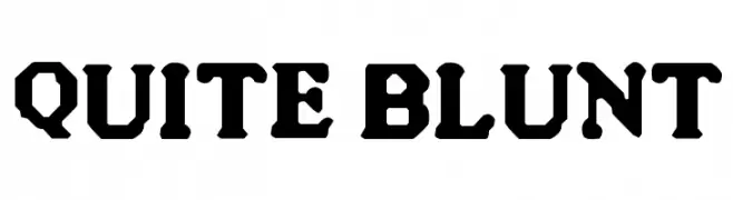
Quite Blunt Font
Quite Blunt Description
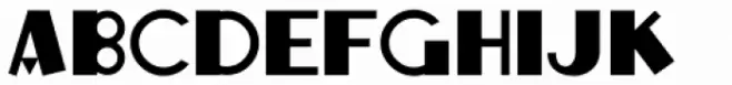
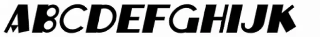
This font features a bold and robust design with a distinct, heavy appearance. The characters are crafted with a unique geometric style, incorporating sharp angles and thick strokes that give it a strong, impactful presence. The uppercase letters are particularly striking, with a uniformity that suggests a sense of stability and strength. The font's design is reminiscent of vintage typefaces, yet it maintains a modern edge through its clean lines and structured form. The spacing between characters is tight, enhancing its boldness and making it ideal for attention-grabbing headlines or titles. Its decorative elements add a touch of flair, making it suitable for projects that require a bold statement.
A bold, geometric font with a vintage yet modern appeal, ideal for impactful headlines from Crazy fonts.
- Downloads: 262
- ( Fonts by Spork Thug Typography - Josh Wilhelm - www.lifewithouttaffy.com/taffy/blog FREE )
- QUITE.TTF
- Font: Quite Blunt
- Weight: Regular
- Version: Version 1.78433
- No. of Characters:: 227
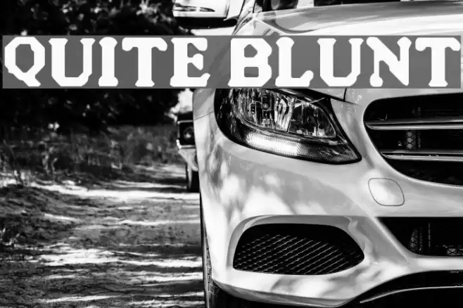
- Proposed Projects: This font is perfect for branding, posters, and any design project that requires a strong, eye-catching typeface.
- Category:
- Bold: Yes
- Italic: No
- Weight: Bold
- Width: Normal
- Character Spacing: Tight
- Contrast: High
- Overall Style: Vintage, Modern
- Use Case: Headlines, Logos
- Encoding Scheme:
- Is Fixed Pitch: No
Glyphs ! # $ % ( ) * + , - . / 0 1 2 3 4 5 6 7 8 9 : ; = ? @ A B C D E F G H I J K L M N O P Q R S T U V W X Y Z [ ] ^ _ ` a b c d e f g h i j k l m n o p q r s t u v w x y z { | } ~
Quite Blunt UPPERCASE
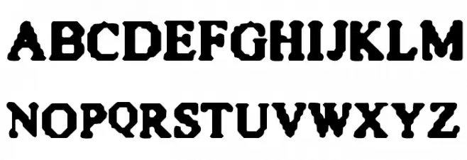
Quite Blunt LOWERCASE
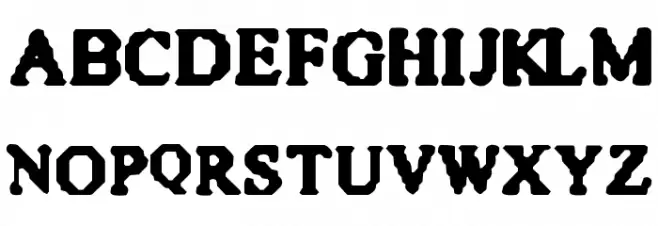
Quite Blunt OTHER CHARS

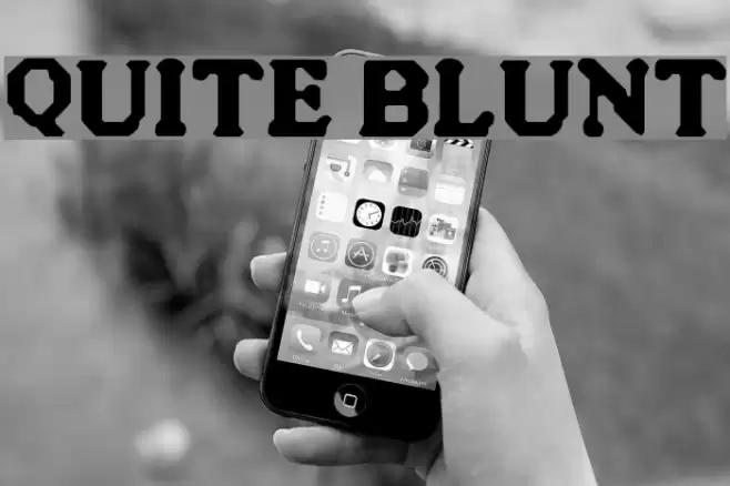
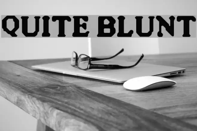
Gallery Examples
Download Free Fonts
Commercial Fonts Fonts
-
 Buy font Quite Animated JNL Commercial Fonts
 -
 Buy font Quite Animated Oblique JNL Commercial Fonts
 -
 Buy font Quite Something Regular Commercial Fonts