Railway-Semibold Font

Railway-Semibold Description
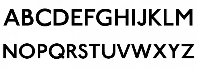
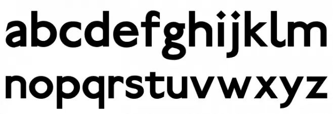
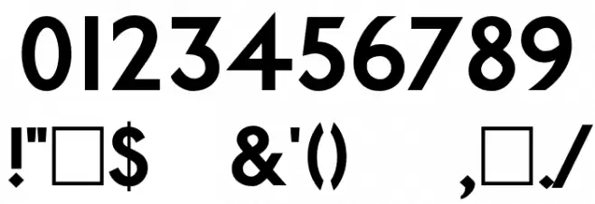
This font exhibits a clean and modern sans-serif style with a semi-bold weight, offering a balanced and versatile appearance. The characters are well-proportioned, with a uniform stroke width that provides a harmonious and professional look. The uppercase letters are bold and assertive, while the lowercase letters maintain a friendly and approachable feel. The numerals are clear and legible, making them suitable for various applications. The special characters are distinct and well-integrated into the overall design, enhancing the font's usability. Its simplicity and clarity make it ideal for both digital and print media.
A modern, semi-bold sans-serif font with clean lines and balanced proportions from Sans Serif fonts.
- Downloads: 1,584
- ( Personal-use only. For commercial use please contact owner. FREE )
- Railway-Semibold.otf
- Font: Railway-Semibold
- Weight: Semibold
- Version: 1999; 1.0, initial release Kernus: V2.0
- No. of Characters:: 142
- Proposed Projects: Ideal for branding, web design, advertising, and editorial projects where clarity and modernity are key.
- Category:
- Bold: Yes
- Italic: No
- Weight: Bold
- Width: Normal
- Character Spacing: Normal
- Contrast: Low
- Overall Style: Modern
- Use Case: Headlines, Body text, Logos
- Encoding Scheme:
- Is Fixed Pitch: No
Glyphs ! $ % ( ) * + , . / 0 1 2 3 4 5 6 7 8 9 : ; ? @ A B C D E F G H I J K L M N O P Q R S T U V W X Y Z ` a b c d e f g h i j k l m n o p q r s t u v w x y z Ĕ ĕ Ė ė Ę ę Ě ‛ ‟
Railway-Semibold UPPERCASE
Railway-Semibold LOWERCASE
Railway-Semibold OTHER CHARS
Gallery Examples

Download Free Fonts
-
 Buy font Railway Point Light Commercial Fonts
 -
 Buy font Railway Point Bold Italic Commercial Fonts
 -
 Buy font Railway Point Normal Italic Commercial Fonts