Free Fonts Decorative/Display
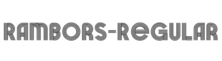
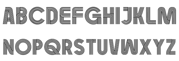
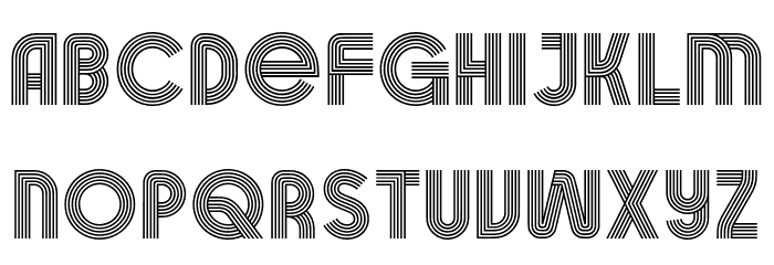
Rambors-Regular Font
Do you have the right license?
Having the right license means that you protect yourself from negative legal consequences of not getting proper permissions. Make sure you have the right license by purchasing the individual font or to use a tool like Envato where all fonts are commercially licensed automatically.
General information
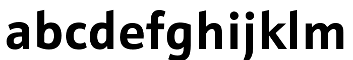
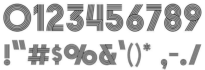
This font features a unique and eye-catching design characterized by multiple parallel lines forming each character, creating a sense of depth and movement. The geometric structure is consistent across uppercase, lowercase, numbers, and special characters, providing a cohesive and modern aesthetic. The lines are evenly spaced, contributing to a clean and organized appearance. This font stands out with its decorative style, making it suitable for creative and bold design projects.
A decorative font with multiple parallel lines creating a modern, geometric look.
- Downloads: 40
- ( Fonts by Arterfak Project FREE )
- Font: Rambors-Regular
- Weight: Regular
- Version: Version 1.000
- No. of Characters:: 106
- Proposed Projects: Ideal for posters, album covers, branding, and any project requiring a bold, modern statement.
- Category: Decorative/Display
- Bold: Yes
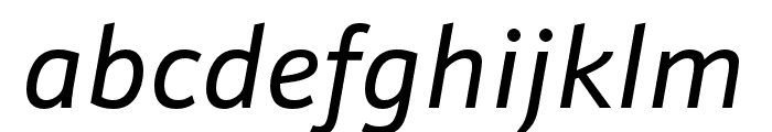
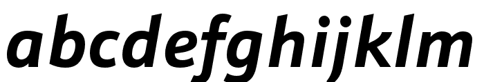
- Italic: No
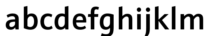
- Weight: Bold
- Width: Normal
- Character Spacing: Normal
- Contrast: Low
- Overall Style: Modern
- Use Case: Headlines, Logos
- Encoding Scheme:
- Is Fixed Pitch: No
Glyphs ! # $ % ( ) * + , - . / 0 1 2 3 4 5 6 7 8 9 : ; = ? @ A B C D E F G H I J K L M N O P Q R S T U V W X Y Z [ ] ^ _ ` a b c d e f g h i j k l m n o p q r s t u v w x y z { | } ~
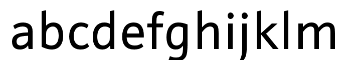
UPPERCASE
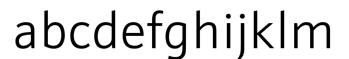
LOWERCASE
OTHER CHARS
Fonts Commercial Fonts
-
 Buy font Schnebel Sans ME Cond Thin Commercial Fonts
 -
Buy font Schnebel Sans ME Cond Regular Commercial Fonts
-
Buy font Schnebel Sans ME Cond Medium Commercial Fonts
-
Buy font Schnebel Sans ME Cond Medium Italic Commercial Fonts
-
Buy font Schnebel Sans ME Cond Light Commercial Fonts
-
Buy font Schnebel Sans ME Cond Light Italic Commercial Fonts
-
Buy font Schnebel Sans ME Cond Italic Commercial Fonts
-
Buy font Schnebel Sans ME Cond Bold Commercial Fonts
-
Buy font Schnebel Sans ME Cond Bold Italic Commercial Fonts
-
Buy font Schnebel Sans ME Cond Black Commercial Fonts
-
Buy font Schnebel Sans ME Cond Black Italic Commercial Fonts
-
Buy font Schnebel Sans ME Comp Thin Commercial Fonts
-
Buy font Schnebel Sans ME Comp Regular Commercial Fonts
-
Buy font Schnebel Sans ME Comp Medium Commercial Fonts
-
Buy font Schnebel Sans ME Comp Medium Italic Commercial Fonts
-
Buy font Schnebel Sans ME Comp Light Commercial Fonts
-
Buy font Schnebel Sans ME Comp Light Italic Commercial Fonts
-
Buy font Schnebel Sans ME Comp Italic Commercial Fonts