Reason to see Evil Font
Reason to see Evil Description
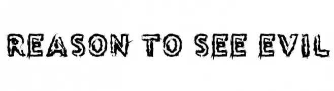
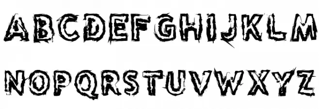
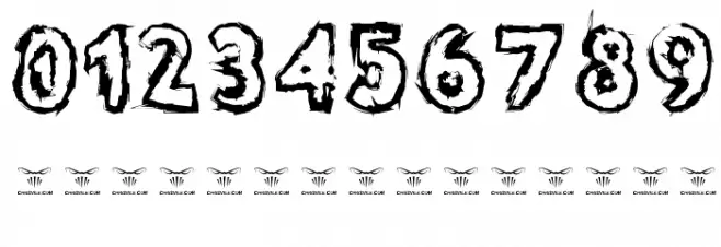
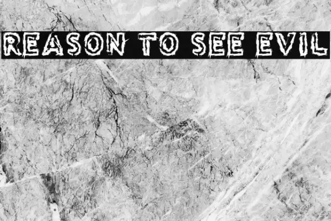
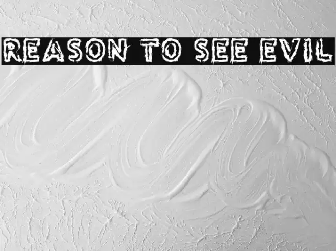
This font features a rugged, distressed appearance with jagged edges and uneven strokes, creating a sense of chaos and intensity. The characters are bold and impactful, with a hand-drawn feel that adds to its raw aesthetic. The uppercase and lowercase letters maintain a consistent style, while the numbers and special characters follow suit with the same edgy design. This font is perfect for projects that require a dramatic and eye-catching look, such as horror-themed designs or edgy branding.
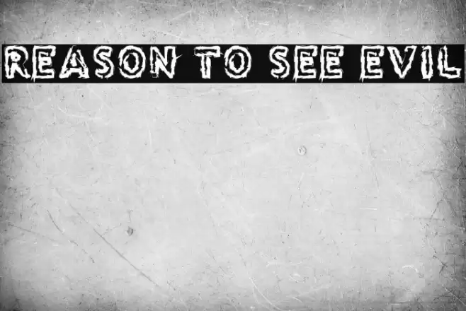
A bold, distressed font with jagged edges and a chaotic, hand-drawn style from Horror fonts.
- Downloads: 149
- ( www.chrisvile.com/ FREE )
- ReasontoseeEvil.ttf
- Font: Reason to see Evil
- Weight: Regular
- Version: Version Version 1.00 2014
- No. of Characters:: 98
- Proposed Projects: Ideal for horror movie posters, edgy branding, Halloween event flyers, and album covers.
- Category:
- Bold: Yes
- Italic: No
- Weight: Bold
- Width: Normal
- Character Spacing: Normal
- Contrast: High
- Overall Style: Decorative
- Use Case: Headlines, Logos
- Encoding Scheme:
- Is Fixed Pitch: No
Glyphs ! # $ % ( ) * + , - . / 0 1 2 3 4 5 6 7 8 9 : ; = ? @ A B C D E F G H I J K L M N O P Q R S T U V W X Y Z [ ] ^ _ ` a b c d e f g h i j k l m n o p q r s t u v w x y z { | } ~
Reason to see Evil UPPERCASE

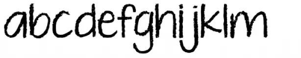
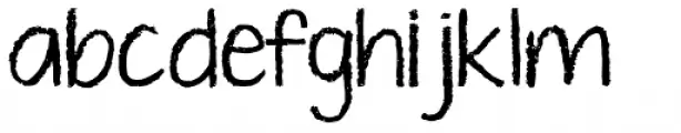
Reason to see Evil LOWERCASE
Reason to see Evil OTHER CHARS
Gallery Examples
Commercial Fonts Fonts
-
 Buy font KG Just Give Me A Reason Commercial Fonts
 -
 Buy font KG Ten Thousand Reasons Commercial Fonts
 -
 Buy font KG Ten Thousand Reasons Alt Commercial Fonts