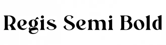
Regis Semi Bold Font
Regis Semi Bold Description
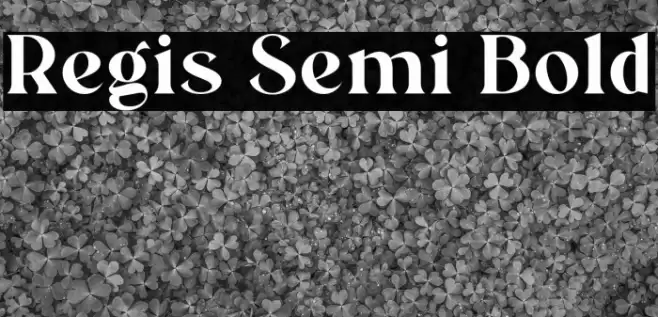
This font features a bold and elegant serif style, characterized by its strong vertical strokes and subtle curves. The uppercase letters exhibit a classic and authoritative presence, while the lowercase letters maintain a harmonious balance with slightly rounded edges. The numerals are distinct and easily readable, with a consistent weight that complements the overall design. Special characters are crafted with precision, adding to the font's versatility. The font's semi-bold weight provides a robust appearance without overwhelming the reader, making it suitable for both display and text purposes.
A bold and elegant serif font with strong vertical strokes and subtle curves from Regular fonts.
- Downloads: 102
- ( Fonts by Type and Company - Personal-use only. For commercial use please contact owner. FREE )
- Font: Regis Semi Bold
- Weight: Regular
- Version: Version Version 1.000
- No. of Characters:: 159
- Proposed Projects: Ideal for branding, editorial design, book covers, and formal invitations.
- Category:
- Bold: Yes
- Italic: No
- Weight: Bold
- Width: Normal
- Character Spacing: Normal
- Contrast: Medium
- Overall Style: Classic
- Use Case: Headlines, Body text, Logos
- Encoding Scheme:
- Is Fixed Pitch: No
Glyphs ! # $ % ( ) * + , - . / 0 1 2 3 4 5 6 7 8 9 : ; = ? @ A B C D E F G H I J K L M N O P Q R S T U V W X Y Z [ ] ^ _ ` a b c d e f g h i j k l m n o p q r s t u v w x y z { | } ~
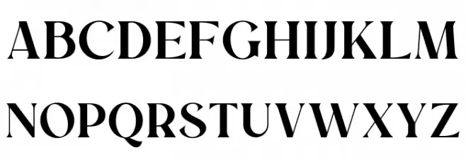
Regis Semi Bold UPPERCASE
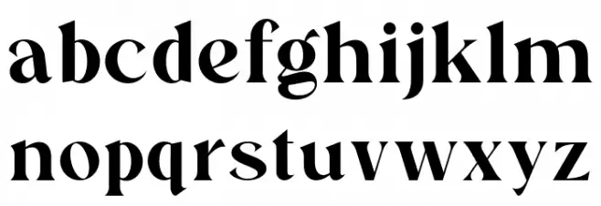
Regis Semi Bold LOWERCASE
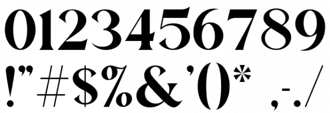
Regis Semi Bold OTHER CHARS
Gallery Examples


-
 Buy font Register Cond Bold Commercial Fonts
 -
 Buy font Register Cond Bold Italic Commercial Fonts
 -
 Buy font Register Wide Bold Commercial Fonts