Right Balance Font
Right Balance Description
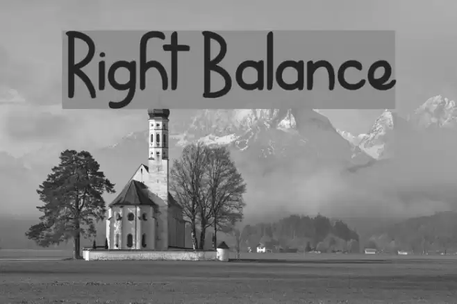
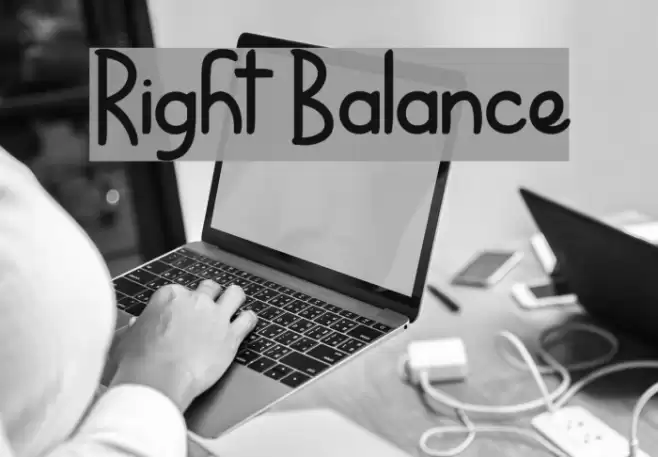
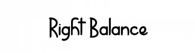
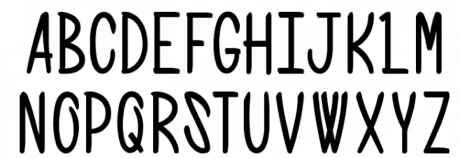
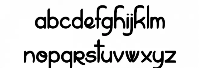
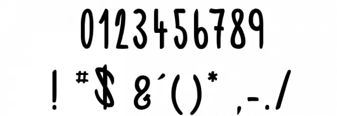
This font features a playful and whimsical style with tall, narrow characters that have a hand-drawn appearance. The uppercase letters are bold and slightly irregular, giving them a unique and informal look. The lowercase letters maintain the same playful quality, with some characters having distinctive loops and curves. The numerals are consistent with the overall style, maintaining the same height and playful design. Special characters are included, each with its own quirky twist, adding to the font's charm. This font is ideal for projects that require a fun and engaging aesthetic.
A playful, hand-drawn font with tall, narrow characters and a whimsical style from Uncategorized fonts.
- Downloads: 278
- ( Fonts by www.dcoxy.com FREE )
- RightBalance.ttf
- Font: Right Balance
- Weight: Regular
- Version: Version Version 001.000
- No. of Characters:: 165
- Proposed Projects: Great for children's books, playful branding, greeting cards, and creative posters.
- Category:
- Bold: No
- Italic: No
- Weight: Regular
- Width: Condensed
- Character Spacing: Normal
- Contrast: Low
- Overall Style: Playful
- Use Case: Headlines, Logos, Posters
- Encoding Scheme:
- Is Fixed Pitch: No
Glyphs ! # $ ( ) * + , - . / 0 1 2 3 4 5 6 7 8 9 : ; = ? @ A B C D E F G H I J K L M N O P Q R S T U V W X Y Z _ ` a b c d e f g h i j k l m n o p q r s t u v w x y z |
Right Balance UPPERCASE
Right Balance LOWERCASE
Right Balance OTHER CHARS
Gallery Examples