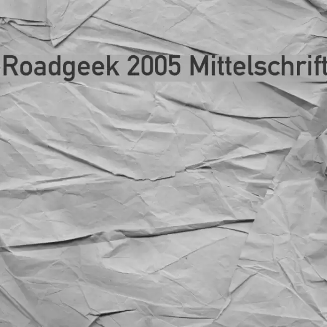
Roadgeek 2005 Mittelschrift Font

Roadgeek 2005 Mittelschrift Description
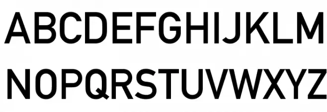
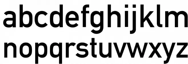
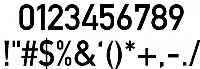
This font features a clean and straightforward sans-serif design, characterized by its geometric shapes and uniform stroke widths. The letters are well-proportioned, offering excellent readability and clarity. The uppercase characters are bold and assertive, while the lowercase letters maintain a consistent height and width, enhancing legibility. The numerals are clear and distinct, making them suitable for various applications. Special characters are designed with the same attention to detail, ensuring a cohesive look across all glyphs. This font is ideal for signage and wayfinding due to its clarity and simplicity.
A clean, geometric sans-serif font with excellent readability from Uncategorized fonts.
- Downloads: 8,438
- ( Michael D. Adams - www.triskele.com/roadgeek-fonts/ FREE )
- Roadgeek 2005 Mittelschrift.ttf
- Font: Roadgeek 2005 Mittelschrift
- Weight: Regular
- Version: Version Version 1.000 2005 initial release
- No. of Characters:: 230
- Proposed Projects: Ideal for road signage, wayfinding systems, and informational displays.
- Category:
- Bold: No
- Italic: No
- Weight: Regular
- Width: Normal
- Character Spacing: Normal
- Contrast: Low
- Overall Style: Modern
- Use Case: Signage, Wayfinding, Informational displays
- Encoding Scheme:
- Is Fixed Pitch: No
Glyphs ! # $ % ( ) * + , - . / 0 1 2 3 4 5 6 7 8 9 : ; = ? @ A B C D E F G H I J K L M N O P Q R S T U V W X Y Z [ ] ^ _ ` a b c d e f g h i j k l m n o p q r s t u v w x y z { | } ~
Roadgeek 2005 Mittelschrift UPPERCASE
Roadgeek 2005 Mittelschrift LOWERCASE
Roadgeek 2005 Mittelschrift OTHER CHARS
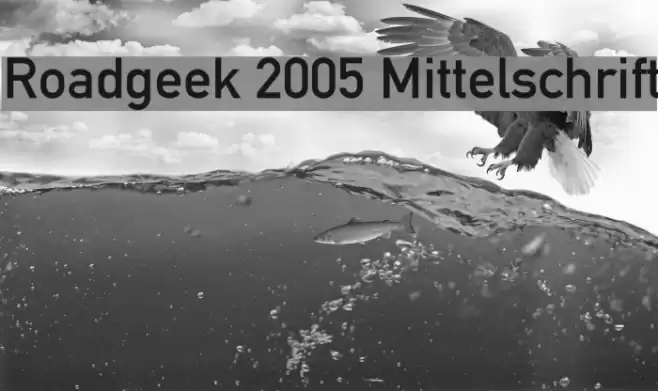
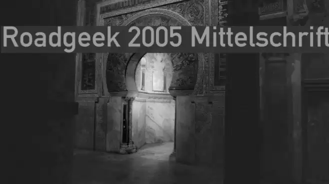
Gallery Examples
Download Free Fonts
-
 Buy font Fette Mittelschrift D Commercial Fonts
 -
 Buy font Mittelschrift Austria D Commercial Fonts
 -
 Buy font DIN 1451 Mittelschrift Commercial Fonts