SAM Display Font
✎ Distorted Eroded
📄 PostScript
🔢 110 chars
⬇ 148
✅ Free
✅ Web Font

SAM Display Description
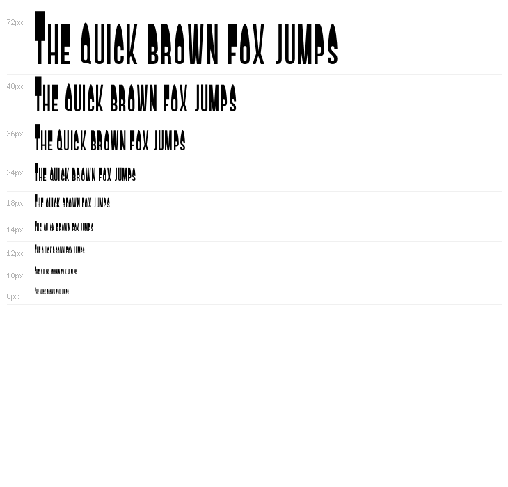
This font features a bold and striking design, characterized by its tall, narrow letterforms and high contrast between thick and thin strokes. The uppercase letters are particularly elongated, giving a sense of height and elegance. The lowercase letters maintain a consistent style, complementing the uppercase with a slightly more compact form. The numbers are bold and easily readable, matching the overall aesthetic. This font is designed to make a strong visual impact, suitable for attention-grabbing headlines and display purposes.
Fonts by Dean Machala

This font includes 110 characters. Click on any character to see details.
Numbers & Symbols
SAM-DISPLAY UPPERCASE

SAM-DISPLAY LOWERCASE

SAM-DISPLAY OTHER CHARS

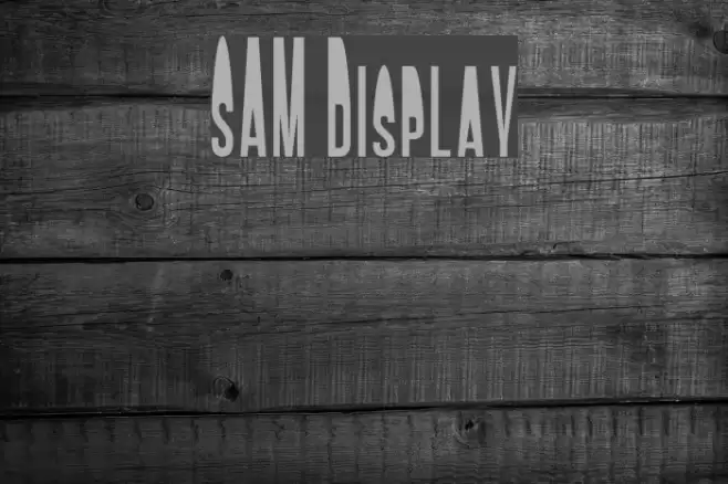
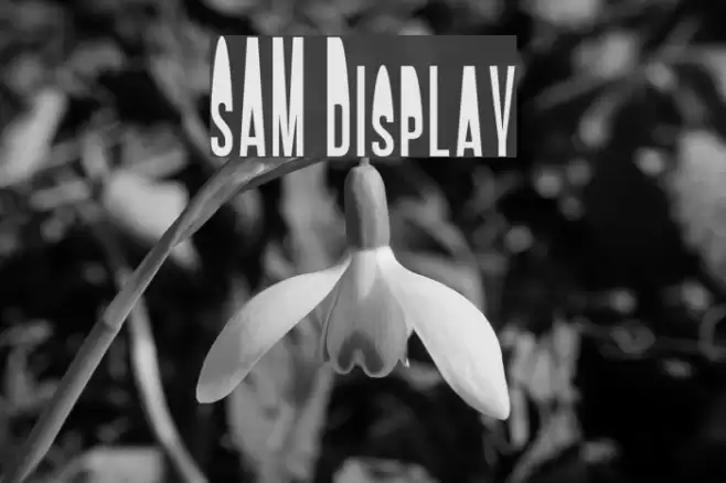
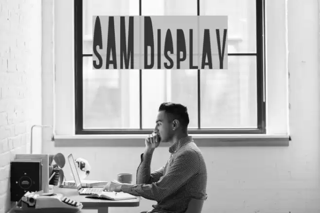
GALLERY EXAMPLES
Similar Free Fonts


Similar Commercial Fonts


Business Card

Social Header

Logo
Poster

Information
| Name | SAM Display |
| TTF Name | SAM Display.otf |
| Font Family | 1 |
| Style | 1 |
| Format | PostScript (.ttf) |
| File | SAM-Display.zip |
| Weight | Display |
| Version | Version 1.001;Fontself Maker 1.0.8 |
| No. of Characters: | 110 |
| Downloads | 148 |
| Added | 2016-12-01 |
| Updated | 2024-11-30 |
| Categories | Distorted Eroded |
| Bold | Yes |
| Italic | No |
| Width | Condensed |
| Character Spacing | Monospaced |
| Contrast | High |
| Overall Style | Modern |
| Use Case | Headlines, Logos |
| Proposed Projects | Perfect for use in posters, advertising, branding, and any project requiring a strong visual presence. |
| Is Fixed Pitch | No |
| Web Font | Available |
| License | Free for personal use |
Fonts by Dean Machala
💻 Windows
- Extract ZIP
- Right-click .ttf -> Install
🍎 macOS
- Extract ZIP
- Double-click .ttf -> Install Font
SAM Display
Free · PostScript
| Name | SAM Display |
| Type | PostScript |
| Characters | 110 |
| Downloads | 148 |
| Added | 2016-12-01 |
| Web Font | Available |
| Author | Fonts by Dean Machala |
| Categories | Distorted Eroded |