Free Fonts Decorative/Display
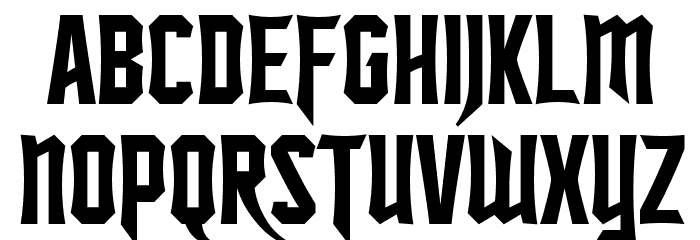
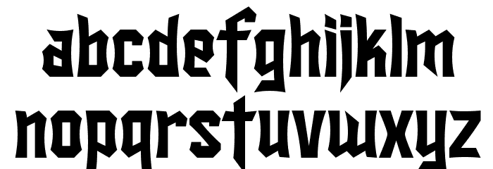
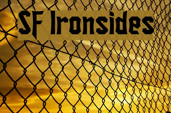
SF Ironsides Font

Do you have the right license?
Having the right license means that you protect yourself from negative legal consequences of not getting proper permissions. Make sure you have the right license by purchasing the individual font or to use a tool like Envato where all fonts are commercially licensed automatically.
General information
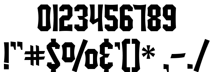
This font features a bold and angular design, characterized by sharp edges and a geometric structure. The uppercase and lowercase letters maintain a consistent style, with a strong emphasis on vertical and diagonal lines. The numerals and special characters follow the same angular theme, creating a cohesive look across all glyphs. The font's unique style makes it stand out, offering a modern and edgy appearance that is both striking and memorable.
A bold, angular font with sharp edges and a geometric structure.
- Downloads: 375
- ( Fonts by www.fugit-tempus.de FREE )
- SF Ironsides.ttf
- Font: SF Ironsides
- Weight: Regular
- Version: Version v1.0 - Freeware
- No. of Characters:: 183
- Proposed Projects: Ideal for projects that require a modern and edgy look, such as posters, album covers, video game titles, and branding for tech or sports companies.
- Category: Decorative/Display
- Bold: Yes
- Italic: No
- Weight: Bold
- Width: Normal
- Character Spacing: Normal
- Contrast: High
- Overall Style: Modern
- Use Case: Headlines, Logos
- Encoding Scheme:
- Is Fixed Pitch: No
Glyphs ! # $ % ( ) * + , - . / 0 1 2 3 4 5 6 7 8 9 : ; = ? @ A B C D E F G H I J K L M N O P Q R S T U V W X Y Z [ ] ^ _ ` a b c d e f g h i j k l m n o p q r s t u v w x y z { | } ~
UPPERCASE
LOWERCASE
OTHER CHARS
Gallery Examples


Download Free Fonts
-
 Astakhov Dished E Download Astakhov Dished E
 -
SF TransRobotics Extended Oblique Download SF TransRobotics Extended Oblique


Commercial Fonts Fonts
-
Intellecta Modern 2 Bold Download Intellecta Modern 2 Bold
Similar free fonts for Intellecta Modern 2 Bold font -
Fishmonger ECB Plain Download Fishmonger ECB Plain
Similar free fonts for Fishmonger ECB Plain font


Fonts Commercial Fonts
-
Buy font Halyard Display Light Italic Commercial Fonts
-
Buy font Halyard Display Italic Commercial Fonts
-
Buy font Halyard Display ExtraLight Commercial Fonts
-
Buy font Halyard Display ExtraLight Italic Commercial Fonts
-
Buy font Halyard Display Book Commercial Fonts
-
Buy font Halyard Display Book Italic Commercial Fonts
-
Buy font Halyard Display Bold Commercial Fonts
-
Buy font Halyard Display Bold Italic Commercial Fonts
-
Buy font Halyard Display Black Commercial Fonts
-
Buy font Halyard Display Black Italic Commercial Fonts
-
Buy font Rigatoni Stencil Regular Commercial Fonts
-
Buy font Rigatoni Regular Italic Commercial Fonts
-
Buy font Spade Round Regular Commercial Fonts
-
Buy font Social Gothic Soft Commercial Fonts
-
Buy font Social Gothic Rough Commercial Fonts
-
Buy font Arboria Thin Commercial Fonts
-
Buy font Arboria Thin Italic Commercial Fonts
-
Buy font Arboria Bold Italic Commercial Fonts