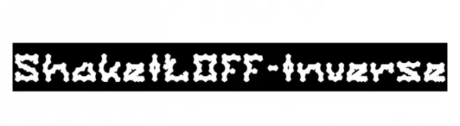
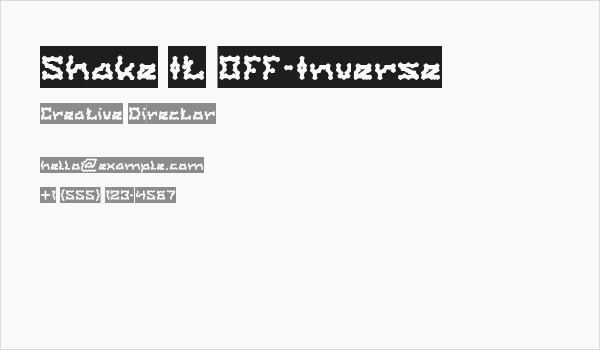
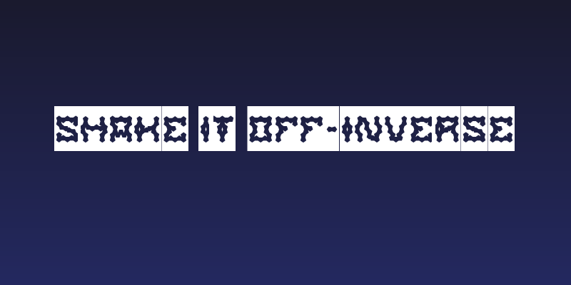
Shake It Off-Inverse Font
✎ Kids
📄 PostScript
🔢 653 chars
⬇ 105
✅ Free
✅ Web Font
Shake It Off-Inverse Description
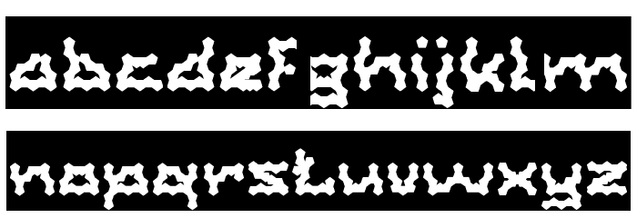
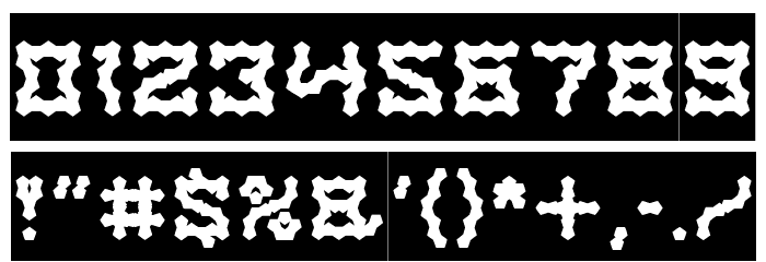
This font features a unique, wavy design that gives each character a playful and dynamic appearance. The letters are bold and have a distinctive, irregular outline that resembles a fluid motion, making them stand out dramatically against the background. The uppercase and lowercase letters maintain this energetic style, with consistent thickness throughout. Numbers and special characters follow the same design principles, ensuring a cohesive look across all glyphs. This font's quirky and lively nature makes it ideal for projects that require a fun and eye-catching aesthetic.
weknow - Wino S Kadir - www.creativefabrica.com/designer/weknow/
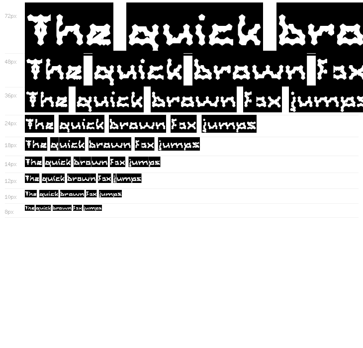
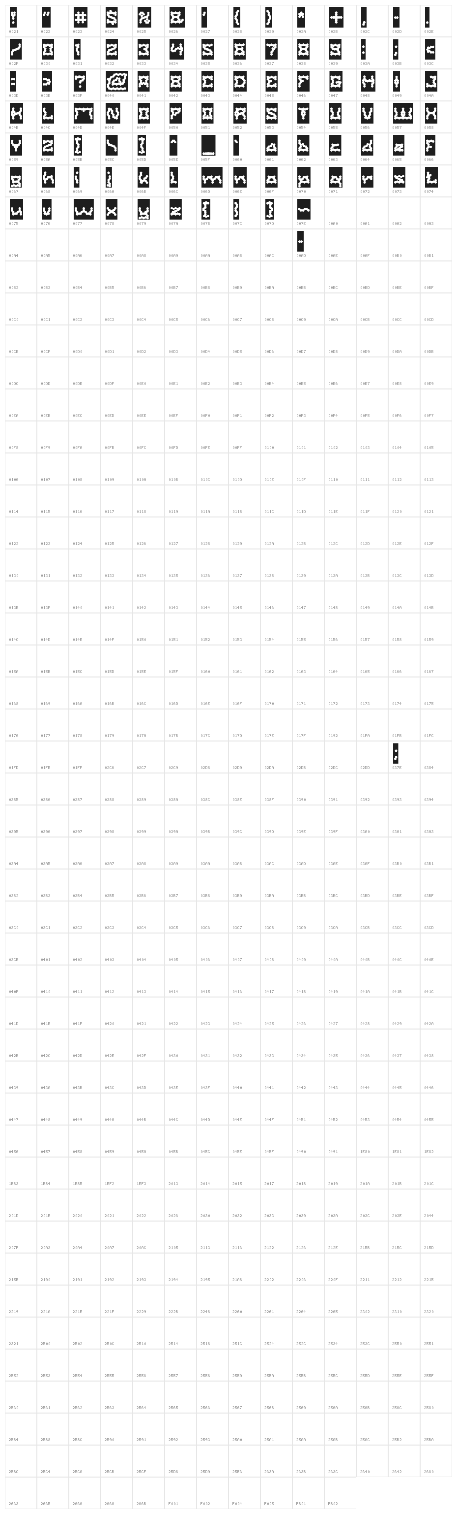
This font includes 653 characters. Click on any character to see details.
Numbers & Symbols
SHAKE-IT-OFF-INVERSE UPPERCASE
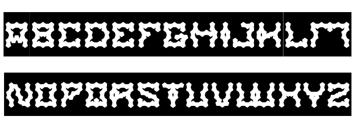
SHAKE-IT-OFF-INVERSE LOWERCASE
SHAKE-IT-OFF-INVERSE OTHER CHARS
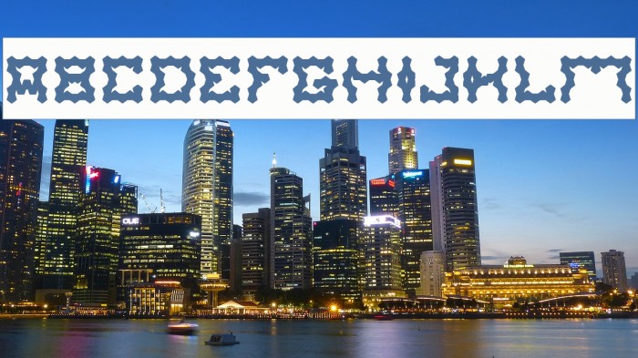
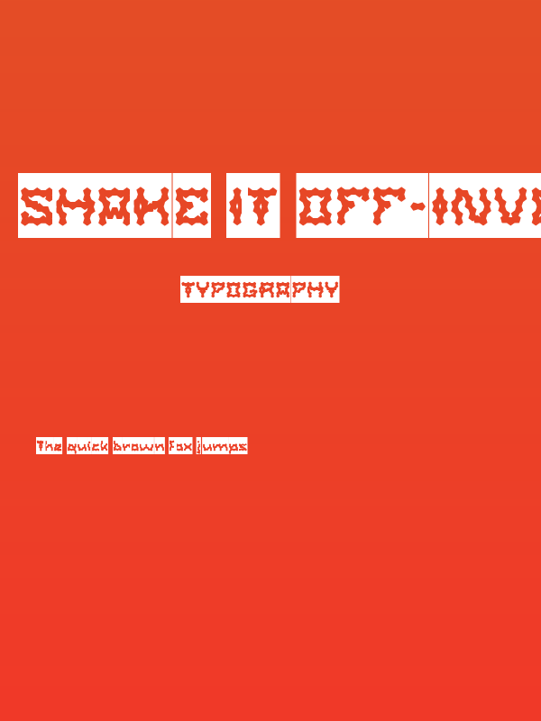
GALLERY EXAMPLES
Similar Free Fonts
Business Card
Social Header
Logo
Poster
Information
| Name | Shake It Off-Inverse |
| TTF Name | Shake It Off-Inverse.otf |
| Font Family | Shake It Off-Inverse |
| Style | Regular |
| Format | PostScript (.ttf) |
| File | Shake-It-Off-Inverse.zip |
| Weight | Regular |
| Version | Version 1.00;January 20, 2018;FontCreator 11.0.0.2 |
| No. of Characters: | 653 |
| Downloads | 105 |
| Added | 2018-11-20 |
| Updated | 2024-11-28 |
| Categories | Kids |
| Bold | Yes |
| Italic | No |
| Width | Normal |
| Character Spacing | Monospaced |
| Contrast | Low |
| Overall Style | Decorative |
| Use Case | Headlines, Logos |
| Proposed Projects | Ideal for children's books, party invitations, playful branding, and creative posters. |
| Is Fixed Pitch | No |
| Web Font | Available |
| License | Free for personal use |
weknow - Wino S Kadir - www.creativefabrica.com/designer/weknow/
Tags
💻 Windows
- Extract ZIP
- Right-click .ttf -> Install
🍎 macOS
- Extract ZIP
- Double-click .ttf -> Install Font
Shake It Off-Inverse
Free · PostScript
| Name | Shake It Off-Inverse |
| Type | PostScript |
| Characters | 653 |
| Downloads | 105 |
| Added | 2018-11-20 |
| Web Font | Available |
| Author | weknow - Wino S Kadir - www.creativefabrica.com/designer/weknow/ |
| Categories | Kids |