Silver Knight Font
Silver Knight Description
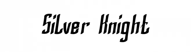
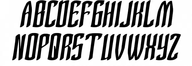
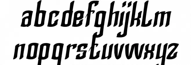
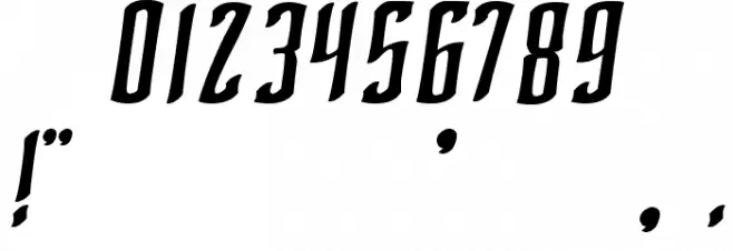
This font features a bold and dynamic style with a strong presence. The characters are slightly slanted, giving a sense of movement and energy. The strokes are thick and consistent, providing a robust and impactful appearance. The uppercase letters are tall and commanding, while the lowercase letters maintain a cohesive flow. The numerals are clear and bold, matching the overall aesthetic. Special characters are designed with the same boldness, ensuring uniformity across all glyphs. This font is ideal for projects that require a strong visual impact.
A bold, dynamic font with slanted characters and strong visual impact from Uncategorized fonts.
- Downloads: 249
- silver knight.ttf
- Font: Silver Knight
- Weight: Regular
- Version: Version Version 1.00 January 15, 2014, initial release
- No. of Characters:: 653
- Proposed Projects: Ideal for sports branding, posters, headlines, and dynamic advertising campaigns.
- Category:
- Bold: Yes
- Italic: No
- Weight: Bold
- Width: Normal
- Character Spacing: Normal
- Contrast: Low
- Overall Style: Modern
- Use Case: Headlines, Logos, Posters
- Encoding Scheme:
- Is Fixed Pitch: No
Glyphs ! # $ % ( ) * + , - . / 0 1 2 3 4 5 6 7 8 9 : ; = ? @ A B C D E F G H I J K L M N O P Q R S T U V W X Y Z [ ] ^ _ ` a b c d e f g h i j k l m n o p q r s t u v w x y z { | } ~
Silver Knight UPPERCASE
Silver Knight LOWERCASE
Silver Knight OTHER CHARS
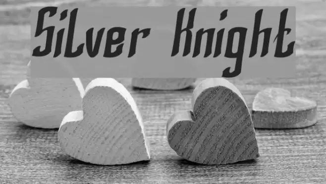
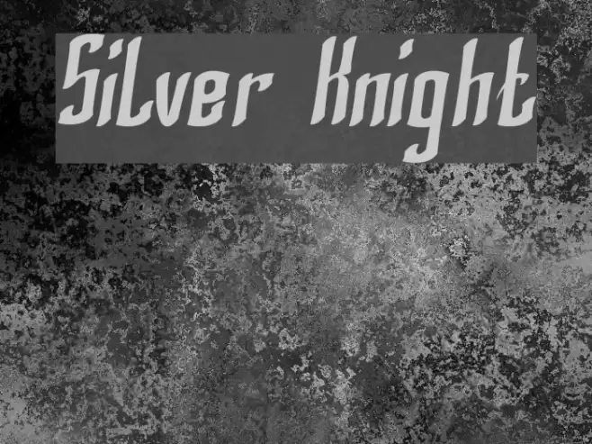
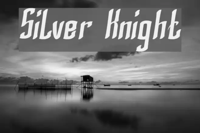
Gallery Examples