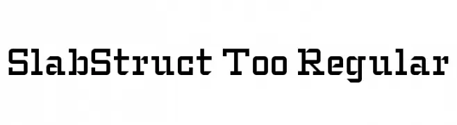
SlabStruct Too Regular Font
SlabStruct Too Regular Description
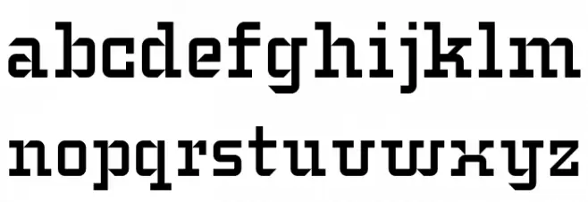
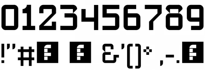
This font features a robust and structured design, characterized by its slab serif style. The letters are bold and have a strong presence, with thick, block-like serifs that give it a sturdy appearance. The uppercase and lowercase letters maintain a consistent weight, providing a uniform look across the alphabet. The numerals are equally bold, ensuring readability and impact. Special characters are designed with the same attention to detail, making them stand out while remaining cohesive with the overall font style. The font's geometric shapes and clean lines make it suitable for projects that require a modern yet classic touch.
A bold, slab serif font with a structured and geometric design from Uncategorized fonts.
- Downloads: 334
- slabstruct_too.ttf
- Font: SlabStruct Too Regular
- Weight: Regular
- Version: Version Version 1.0
- No. of Characters:: 139
- Proposed Projects: Ideal for branding, headlines, posters, and any design requiring a strong, impactful typeface.
- Category:
- Bold: Yes
- Italic: No
- Weight: Bold
- Width: Normal
- Character Spacing: Normal
- Contrast: Low
- Overall Style: Modern
- Use Case: Headlines, Logos, Posters
- Encoding Scheme:
- Is Fixed Pitch: No
Glyphs ! # ( ) * , - . 0 1 2 3 4 5 6 7 8 9 : ; ? @ A B C D E F G H I J K L M N O P Q R S T U V W X Y Z [ _ a b c d e f g
SlabStruct Too Regular UPPERCASE
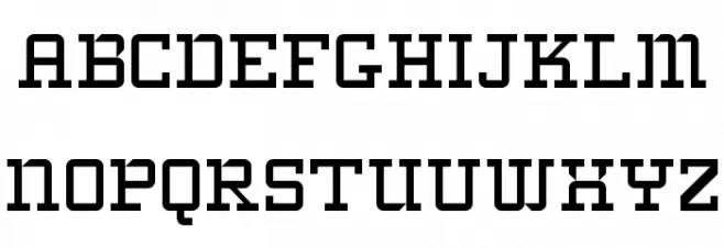
SlabStruct Too Regular LOWERCASE
SlabStruct Too Regular OTHER CHARS
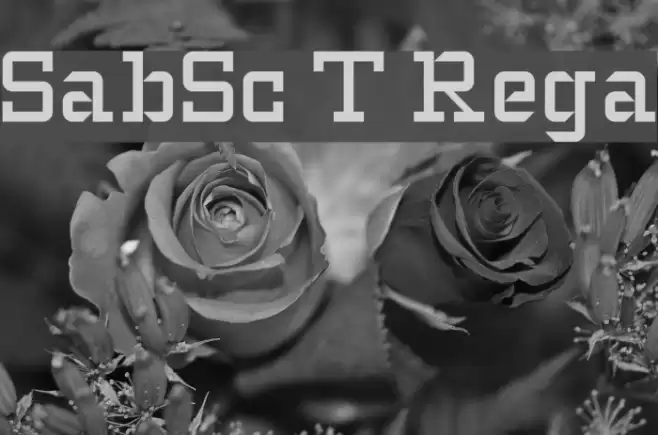
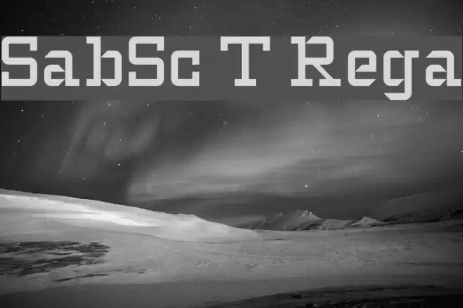
Gallery Examples