Free Fonts Decorative/Display
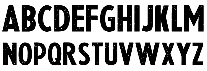
Slightly Eroded Font

Do you have the right license?
Having the right license means that you protect yourself from negative legal consequences of not getting proper permissions. Make sure you have the right license by purchasing the individual font or to use a tool like Envato where all fonts are commercially licensed automatically.
General information
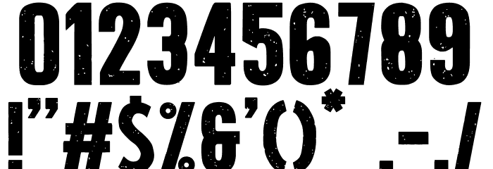
This font features a bold, distressed style with a slightly eroded texture that gives it a rugged, vintage appearance. The characters are uniformly bold with a consistent weight, making them stand out prominently. The eroded effect adds a unique, weathered look, reminiscent of old signage or worn-out prints. The uppercase and lowercase letters maintain a strong geometric structure, while the numbers and special characters follow the same design ethos, ensuring a cohesive look across all glyphs. This font is perfect for projects that require a touch of nostalgia or a gritty, industrial feel.
A bold, distressed font with an eroded, vintage texture.
- Downloads: 127
- ( Fonts by imagex - Personal-use only. For commercial use please contact owner. FREE )
- Font: Slightly Eroded
- Weight: Regular
- Version: Version Version 1.00 August 13, 2020, initial release
- No. of Characters:: 102
- Proposed Projects: Ideal for vintage posters, branding, packaging, and apparel design.
- Category: Decorative/Display
- Bold: Yes
- Italic: No
- Weight: Bold
- Width: Normal
- Character Spacing: Normal
- Contrast: Low
- Overall Style: Vintage
- Use Case: Headlines, Logos
- Encoding Scheme:
- Is Fixed Pitch: No
Glyphs ! # $ % ( ) * + , - . / 0 1 2 3 4 5 6 7 8 9 : ; = ? A B C D E F G H I J K L M N O P Q R S T U V W X Y Z _ `
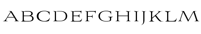
UPPERCASE

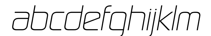
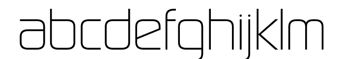
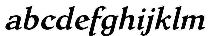
LOWERCASE
OTHER CHARS
Fonts Commercial Fonts
-
 Buy font Aviano Royale Thin Commercial Fonts
 -
Buy font Sol Pro Black Italic Commercial Fonts
-
Buy font Sol Pro Black Commercial Fonts
-
Buy font Sol Pro Bold Commercial Fonts
-
Buy font Sol Pro Bold Italic Commercial Fonts
-
Buy font Sol Pro Italic Commercial Fonts
-
Buy font Sol Pro Light Italic Commercial Fonts
-
Buy font Sol Pro Light Commercial Fonts
-
Buy font Sol Pro Medium Italic Commercial Fonts
-
Buy font Sol Pro Medium Commercial Fonts
-
Buy font Sol Pro Regular Commercial Fonts
-
Buy font Latex Regular Commercial Fonts
-
Buy font Latex Top Commercial Fonts
-
Buy font Dutch Mediaeval Pro Bold Italic Commercial Fonts
-
Buy font Dutch Mediaeval Pro Bold Commercial Fonts
-
Buy font Dutch Mediaeval Pro Italic Commercial Fonts
-
Buy font Dutch Mediaeval Pro Regular Commercial Fonts
-
Buy font Gira Sans Bold Italic Commercial Fonts