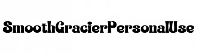
Smooth Gracier Personal Use Font
Smooth Gracier Personal Use Description
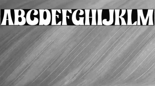
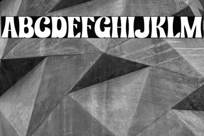
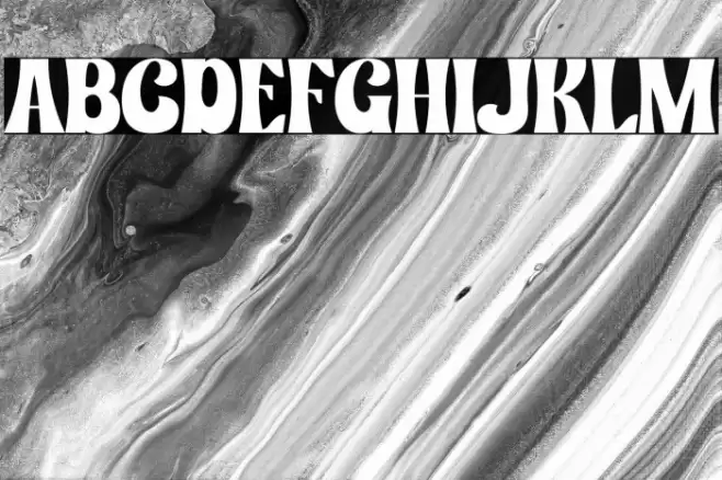
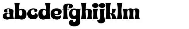
This font features a bold and dynamic design with a strong presence. The characters are wide and have a distinct, playful flair, making them stand out. The uppercase letters are particularly striking with their exaggerated curves and thick strokes, while the lowercase letters maintain a consistent style that complements the uppercase. The numbers and special characters follow the same bold aesthetic, ensuring a cohesive look across all text. The font's overall style is both modern and decorative, suitable for projects that require a strong visual impact.
A bold, decorative font with exaggerated curves and thick strokes from Uncategorized fonts.
- Downloads: 168
- ( Fonts by Raina FREE )
- Font: Smooth Gracier Personal Use
- Weight:
- Version:
- No. of Characters:: over 20
- Proposed Projects: Ideal for headlines, posters, branding, and any design that requires a bold statement.
- Category:
- Bold: Yes
- Italic: No
- Weight: Bold
- Width: Expanded
- Character Spacing: Normal
- Contrast: High
- Overall Style: Modern, Decorative
- Use Case: Headlines, Logos, Posters
- Encoding Scheme:
- Is Fixed Pitch: No
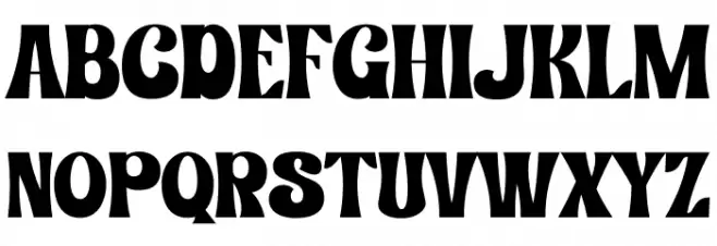
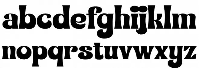
Glyphs
Smooth Gracier Personal Use UPPERCASE
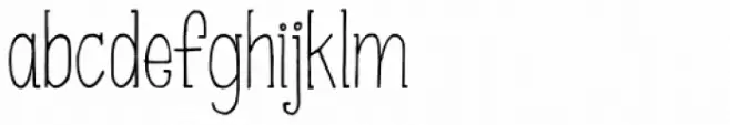
Smooth Gracier Personal Use LOWERCASE
Smooth Gracier Personal Use OTHER CHARS
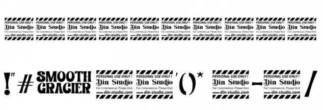
Gallery Examples
Download
168 Downloads
-
 Buy font Smooth Gracier Regular Commercial Fonts
 -
 Buy font KG Somebody That I Used To Know Commercial Fonts
 -
 Buy font Used Cars Slanted JNL Commercial Fonts