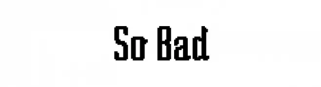
So Bad Font
So Bad Description
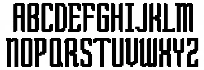
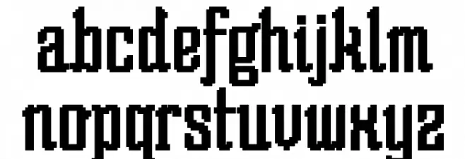
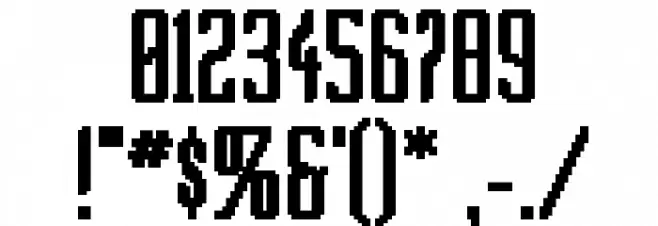
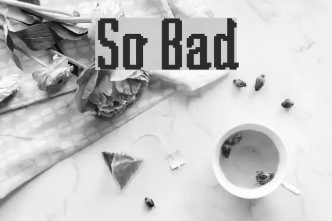
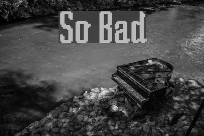
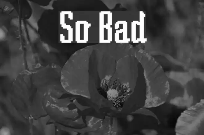
This font features a bold and condensed style with a distinctly modern and geometric appearance. The characters are uniformly structured with sharp edges and a consistent stroke width, giving it a digital or pixelated look. The uppercase and lowercase letters maintain a uniform height, contributing to its compact and structured feel. The numerals and special characters follow the same design principles, ensuring a cohesive appearance across all glyphs. This font's unique style makes it stand out, ideal for projects that require a strong visual impact.
A bold, condensed, and geometric font with a modern, pixelated style from Futuristic fonts.
- Downloads: 197
- ( Fonts by Apostrophic Lab FREE )
- SOBAD___.ttf
- Font: So Bad
- Weight: Regular
- Version: Version Version 1.5; 2002
- No. of Characters:: 228
- Proposed Projects: Ideal for digital art, video game design, posters, and any project needing a modern, tech-inspired aesthetic.
- Category:
- Bold: Yes
- Italic: No
- Weight: Bold
- Width: Condensed
- Character Spacing: Tight
- Contrast: Low
- Overall Style: Modern
- Use Case: Headlines, Logos, Digital Art
- Encoding Scheme:
- Is Fixed Pitch: No
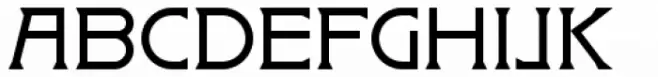
Glyphs ! # $ % ( ) * + , - . / 0 1 2 3 4 5 6 7 8 9 : ; = ? @ A B C D E F G H I J K L M N O P Q R S T U V W X Y Z [ ] ^ _ ` a b c d e f g h i j k l m n o p q r s t u v w x y z { | }
So Bad UPPERCASE
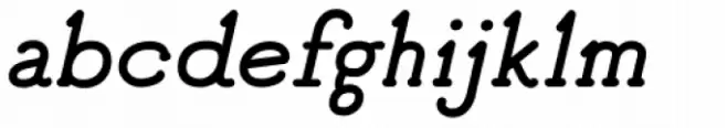
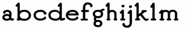
So Bad LOWERCASE
So Bad OTHER CHARS
Gallery Examples
Download Free Fonts
Commercial Fonts Fonts
-
 Buy font Badehaus Commercial Fonts
 -
 Buy font Good Bad Man Italic Commercial Fonts
 -
 Buy font Good Bad Man Commercial Fonts