Splinter2 Font
✎ Fancy
📄 PostScript
🔢 99 chars
⬇ 7,712
✅ Free
✅ Web Font

Splinter2 Description
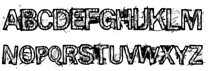
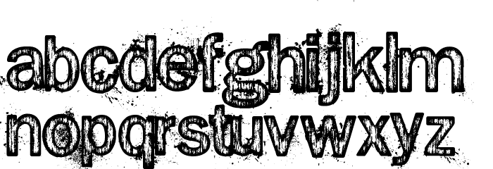
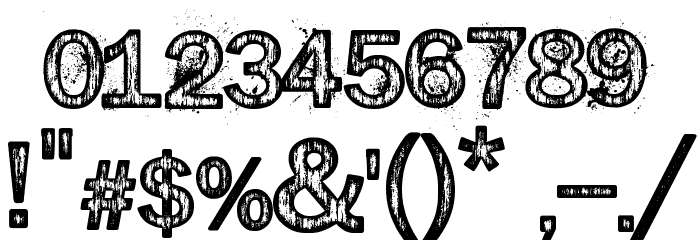
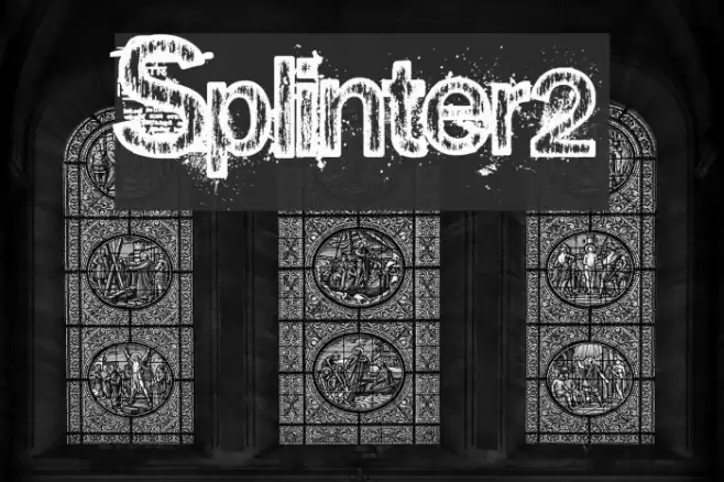
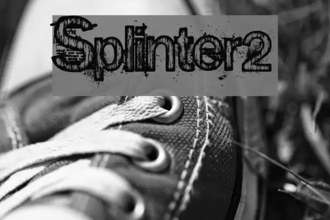
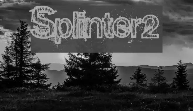
This font features a distressed, grunge style with a textured appearance that gives it a rugged and worn look. The characters are bold and have a rough, uneven surface, reminiscent of weathered or eroded materials. The uppercase and lowercase letters maintain a consistent style, with jagged edges and a slightly chaotic feel. Numbers and special characters follow the same design, ensuring a cohesive appearance across all glyphs. This font's unique aesthetic makes it stand out, offering a sense of edginess and rawness.
Fonts by Andrew Hart - dirt2.com
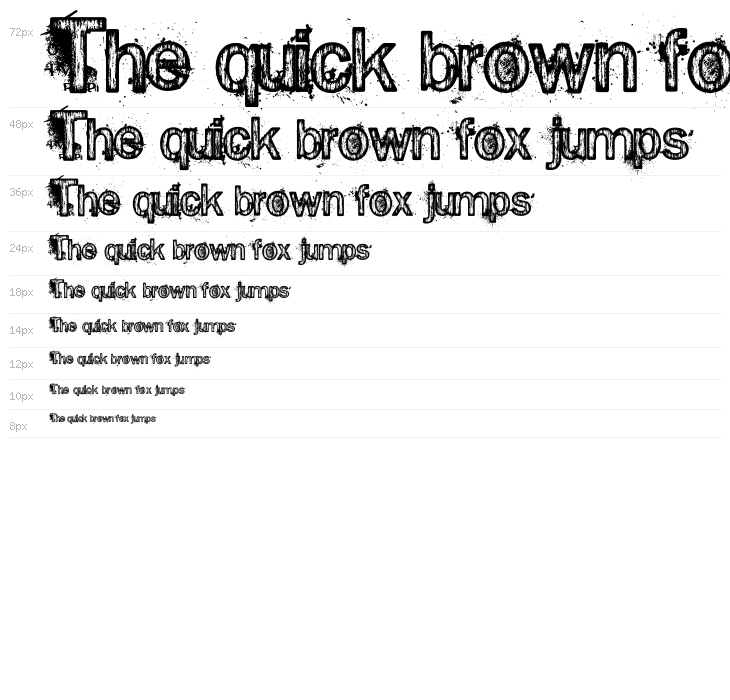

This font includes 99 characters. Click on any character to see details.
Numbers & Symbols
SPLINTER2 UPPERCASE
SPLINTER2 LOWERCASE
SPLINTER2 OTHER CHARS
GALLERY EXAMPLES
Similar Free Fonts

Similar Commercial Fonts


Business Card

Social Header

Logo
Poster

Information
| Name | Splinter2 |
| TTF Name | splinter2.ttf |
| Font Family | 1 |
| Style | 1 |
| Format | PostScript (.ttf) |
| File | Splinter2.zip |
| Weight | Regular |
| Version | v.1.5 |
| No. of Characters: | 99 |
| Downloads | 7,712 |
| Added | 2009-07-21 |
| Updated | 2024-12-06 |
| Categories | Fancy |
| Bold | Yes |
| Italic | No |
| Width | Normal |
| Character Spacing | Monospaced |
| Contrast | Low |
| Overall Style | Grunge, Distressed |
| Use Case | Headlines, Posters, Branding |
| Proposed Projects | Ideal for music album covers, edgy posters, urban-themed branding, and any project requiring a gritty, raw aesthetic. |
| Is Fixed Pitch | No |
| Web Font | Available |
| License | Free for personal use |
Fonts by Andrew Hart - dirt2.com
Tags
💻 Windows
- Extract ZIP
- Right-click .ttf -> Install
🍎 macOS
- Extract ZIP
- Double-click .ttf -> Install Font
Splinter2
Free · PostScript
| Name | Splinter2 |
| Type | PostScript |
| Characters | 99 |
| Downloads | 7,712 |
| Added | 2009-07-21 |
| Web Font | Available |
| Author | Fonts by Andrew Hart - dirt2.com |
| Categories | Fancy |