SplinterMKaps Font

SplinterMKaps Description
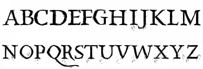
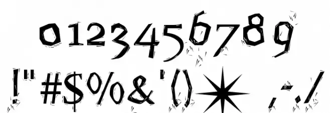
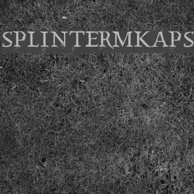
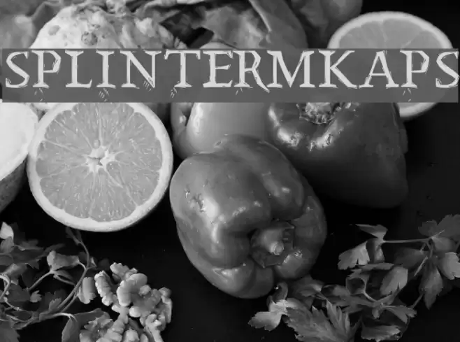
This font features a rugged, distressed style with sharp, angular edges and a hand-drawn appearance. The characters have a unique, splintered look, giving them an edgy and dynamic feel. The uppercase and lowercase letters maintain a consistent design, with a slightly irregular baseline that adds to the font's organic and raw aesthetic. The numerals and special characters follow the same design principles, ensuring a cohesive look across all glyphs. This font's distinctive style makes it suitable for projects that require a bold and unconventional appearance.
A rugged, distressed font with sharp, angular edges and a hand-drawn look from Uncategorized fonts.
- Downloads: 161
- ( Fonts by Manfred Klein. Free for private and charity use. Free for commercial with donation to organizations FREE )
- SplinterMKaps.ttf
- Font: SplinterMKaps
- Weight: Regular
- Version: Version 1.0 2003-04-07
- No. of Characters:: 216
- Proposed Projects: Ideal for album covers, posters, video game graphics, and any project needing a bold, edgy aesthetic.
- Category:
- Bold: Yes
- Italic: No
- Weight: Bold
- Width: Normal
- Character Spacing: Normal
- Contrast: High
- Overall Style: Modern, Edgy
- Use Case: Headlines, Logos, Posters
- Encoding Scheme:
- Is Fixed Pitch: No
Glyphs ! # $ % ( ) * + , - . / 0 1 2 3 4 5 6 7 8 9 : ; = ? @ A B C D E F G H I J K L M N O P Q R S T U V W X Y Z [ ] ^ _ ` a b c d e f g h i j k l m n o p q r s t u v w x y z { | } ~
SplinterMKaps UPPERCASE

SplinterMKaps LOWERCASE
SplinterMKaps OTHER CHARS
Gallery Examples

Download Free Fonts
Commercial Fonts Fonts
-
 Buy font Mansel Semi Bold Condensed Commercial Fonts
 -
 Buy font Mansel Semi Bold Condensed Italic Commercial Fonts
 -
 Buy font Mansel Bold Condensed Commercial Fonts