Fonts
Spotted Rail Ticket Font
Description
- spotted-rail-ticket.otf
- Font: Spotted Rail Ticket
- Weight:
- Version: Version 1.00;February 4, 2021;FontCreator 11.5.0.2422 64-bit
- No. of Characters:: 223
- Encoding Scheme:
- Is Fixed Pitch: 0
Welcome to the Font Trends page — your destination for discovering which fonts are shaping today’s design landscape. Whether you’re working on a brand refresh, social media visuals, or website UI, following current font trends helps your work feel fresh and relevant.
This collection features the most trending fonts of the season, chosen by designers and creators across the world. Expect to see elegant serifs, minimalist sans serifs, expressive display fonts, and handcrafted scripts that define modern aesthetics in 2025.
Combine your favorite trending typefaces with timeless categories like Modern, Serif, or Handwritten for a balanced and eye-catching design.
-
( Fonts by www.matchfonts.com - Michel Bujardet )
A bold, decorative font with a vintage and ornate style.
![Bujardet Freres [Unregistered] Free Fonts Download](https://d144mzi0q5mijx.cloudfront.net/img/B/U/Bujardet-Freres-Unregistered.webp) Download 483 Downloads@WebFont
Download 483 Downloads@WebFont -
![Blomster Free Fonts Download]() Download 5968 Downloads@WebFont
Download 5968 Downloads@WebFont -
![Def Writer | BASE Cyr Free Fonts Download]() Download 342 Downloads@WebFont
Download 342 Downloads@WebFont -
( Fonts by Apostrophic Lab )
A classic, medieval-inspired font with sharp, angular lines and intricate detailing.
![BoereTudor Free Fonts Download]() Download 1137 Downloads@WebFont
Download 1137 Downloads@WebFont -
![Runic Alt Free Fonts Download]() Download 992 Downloads@WebFont
Download 992 Downloads@WebFont -
( Fonts by www.stimuleyefonts.com )
A decorative font with a fragmented, abstract style and a distressed aesthetic.
![Mascara Mistake Free Fonts Download]() Download 279 Downloads@WebFont
Download 279 Downloads@WebFont -
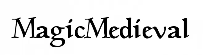
![MagicMedieval Free Fonts Download]() Download 3866 Downloads@WebFont
Download 3866 Downloads@WebFont -
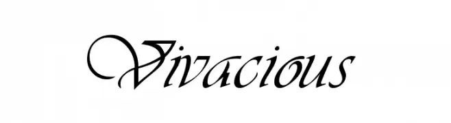
![Vivacious Free Fonts Download]() Download 2755 Downloads
Download 2755 Downloads

FAQ — Font Trends
What are the current font trends?
Simplicity, legibility, and warmth dominate: rounded sans serifs, high-contrast serifs, and tasteful retro revivals are everywhere — clean but human.
Which fonts are trending in design right now?
Popular choices include Bujardet Freres [Unregistered], Blomster, Def Writer | BASE Cyr, BoereTudor and Runic Alt — fonts known for their balance between modern and timeless. They look great on web pages, social content, and packaging, bringing a clean yet expressive feel.
How do I use trending fonts in my projects?
Use one standout display font for titles and pair it with a simple sans serif for body text. This creates contrast without losing readability. Always test how your chosen font trend performs across screen sizes and branding materials before finalizing.
💡 Tip: Refresh key assets every few months with a new trending font to keep visuals sharp and discoverable.