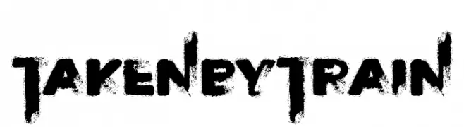
Taken by Train Font
Taken by Train Description
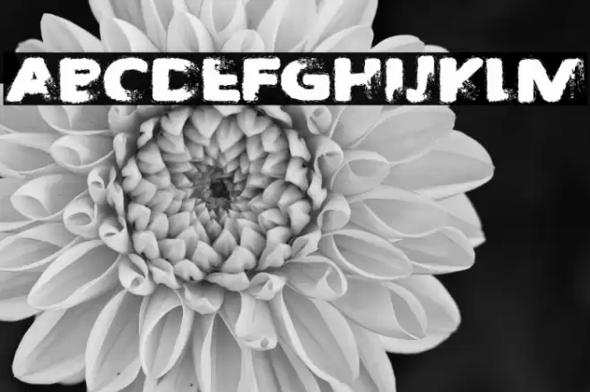
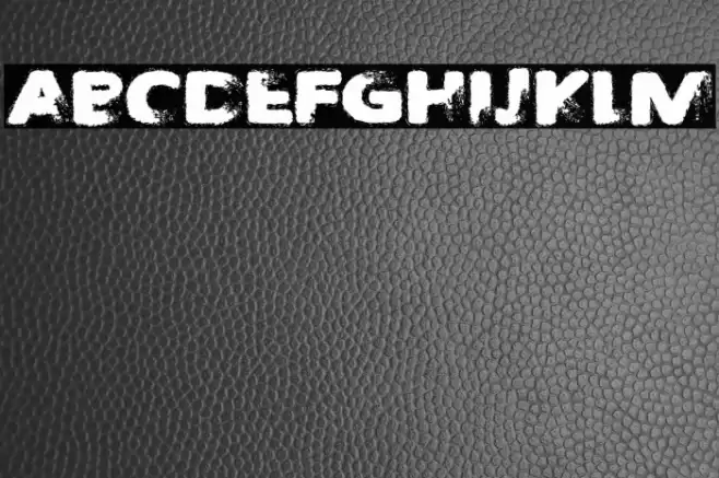
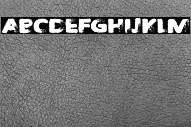
This font features a bold, distressed style with a textured, grunge appearance. The characters have a rough, uneven edge that gives them a worn, vintage look. The uppercase and lowercase letters maintain a consistent height, creating a uniform appearance despite the distressed texture. The numbers and special characters follow the same design, ensuring a cohesive look across all glyphs. This font is ideal for projects that require a rugged, industrial aesthetic, such as posters, album covers, or branding for edgy, alternative brands.
A bold, distressed font with a grunge, vintage appearance from Uncategorized fonts.
- Downloads: 52
- ( Fonts by Font Monger - Chris Vile - Personal-use only. For commercial use please contact owner. FREE )
- Font: Taken by Train
- Weight:
- Version:
- No. of Characters:: over 20
- Proposed Projects: Perfect for posters, album covers, and edgy branding projects.
- Category:
- Bold: Yes
- Italic: No
- Weight: Bold
- Width: Normal
- Character Spacing: Normal
- Contrast: Low
- Overall Style: Vintage
- Use Case: Headlines, Logos
- Encoding Scheme:
- Is Fixed Pitch: No
Glyphs
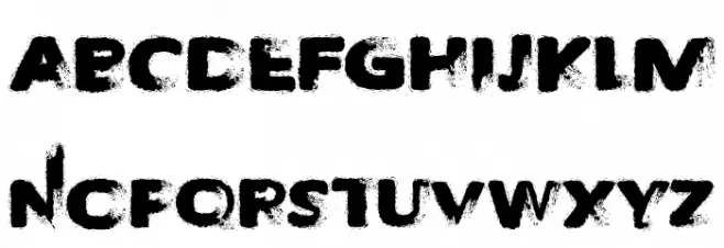
Taken by Train UPPERCASE
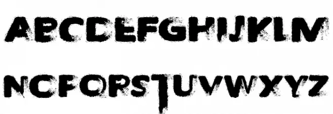
Taken by Train LOWERCASE
Taken by Train OTHER CHARS
Gallery Examples
Download
52 Downloads
-
 Buy font Point Taken JNL Commercial Fonts
 -
 Buy font Train of thought Commercial Fonts
 -
 Buy font Night Train Black Commercial Fonts