Free Fonts Decorative/Display
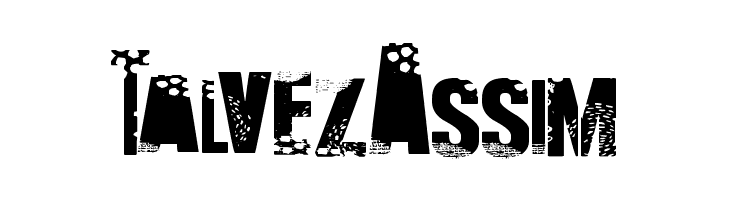
Talvez Assim Font
Do you have the right license?
Having the right license means that you protect yourself from negative legal consequences of not getting proper permissions. Make sure you have the right license by purchasing the individual font or to use a tool like Envato where all fonts are commercially licensed automatically.
General information
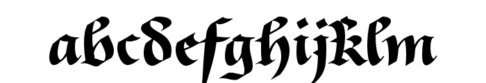
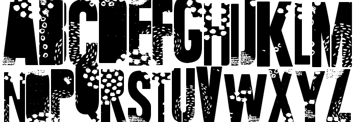
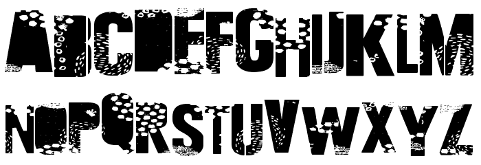
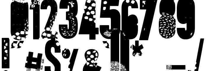
This font features a bold and distressed style, characterized by its heavy, block-like letters with a unique textured pattern that resembles erosion or decay. The uppercase and lowercase letters maintain a consistent width, giving the font a uniform appearance despite its rugged texture. Numbers and special characters follow the same design, ensuring a cohesive look across all glyphs. The font's distinct style makes it stand out, with a strong visual impact that is both modern and edgy. Its decorative nature lends itself well to projects that require a bold statement.
A bold, distressed font with a textured, eroded appearance.
- Downloads: 10
- ( Fonts by PintassilgoPrints - Personal-use only. For commercial use please contact owner. FREE )
- Font: Talvez Assim
- Weight:
- Version:
- No. of Characters:: over 20
- Proposed Projects: Ideal for posters, album covers, branding for edgy or alternative products, and any design needing a strong, impactful visual element.
- Category: Decorative/Display
- Bold: Yes
- Italic: No
- Weight: Bold
- Width: Normal
- Character Spacing: Normal
- Contrast: Low
- Overall Style: Modern, Edgy
- Use Case: Headlines, Logos, Posters
- Encoding Scheme:
- Is Fixed Pitch: No
Glyphs
UPPERCASE
LOWERCASE
OTHER CHARS
Fonts Commercial Fonts
-
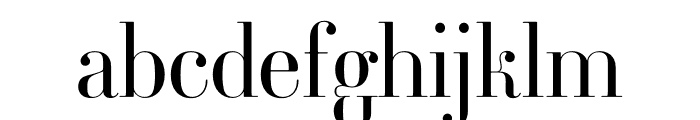
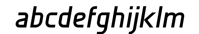
 Buy font Ambroise Std Light Commercial Fonts
 -
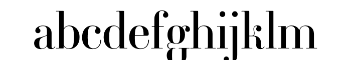
Buy font Ambroise Std Regular Commercial Fonts
-
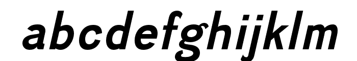
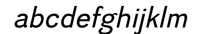
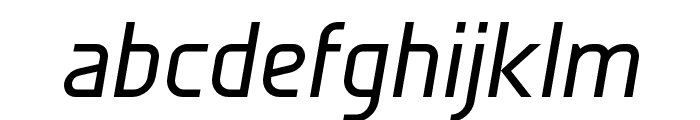
Buy font Divulge Bold Italic Commercial Fonts
-
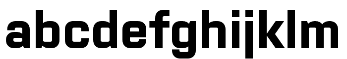
Buy font Divulge Bold Commercial Fonts
-
Buy font Divulge Italic Commercial Fonts
-
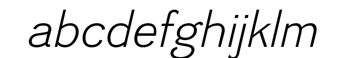
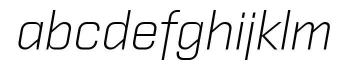
Buy font Divulge Light Italic Commercial Fonts
-
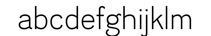
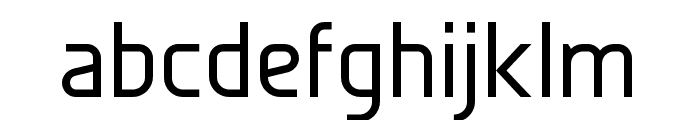
Buy font Divulge Light Commercial Fonts
-
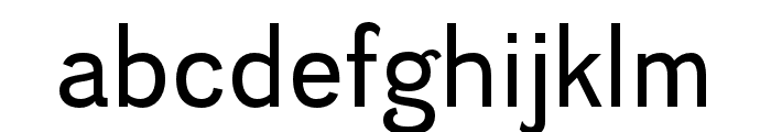
Buy font Divulge Regular Commercial Fonts
-
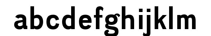
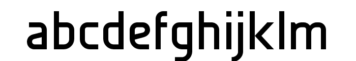
Buy font Givry Regular Commercial Fonts
-
Buy font Galette Bold Oblique Commercial Fonts
-
Buy font Galette Bold Commercial Fonts
-
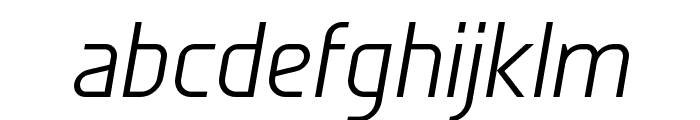
Buy font Galette Light Oblique Commercial Fonts
-
Buy font Galette Medium Oblique Commercial Fonts
-
Buy font Galette Medium Commercial Fonts
-
Buy font Purista Bold Italic Commercial Fonts
-
Buy font Purista Bold Commercial Fonts
-
Buy font Purista Light Italic Commercial Fonts
-
Buy font Purista Light Commercial Fonts