That's not what I meant... Font

That's not what I meant... Description
This font features a bold and expressive style with a hand-painted appearance. The characters are irregular and slightly rough around the edges, giving it a raw, artistic feel. The strokes are thick and uneven, adding to its dynamic and energetic look. It captures a sense of spontaneity and creativity, making it ideal for projects that require a personal touch. The font includes a full set of uppercase and lowercase letters, numbers, and a variety of special characters, all maintaining the same bold, handcrafted aesthetic.
A bold, hand-painted style font with an expressive and artistic appearance from Uncategorized fonts.
- Downloads: 253
- That's not what I meant....ttf
- Font: That's not what I meant...
- Weight: Regular
- Version: Version Lanier My Font Tool for Tablet PC 1.0
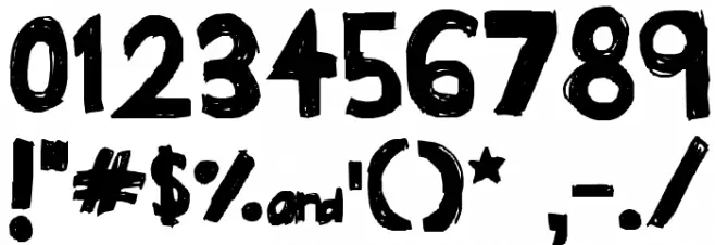
- No. of Characters:: 96
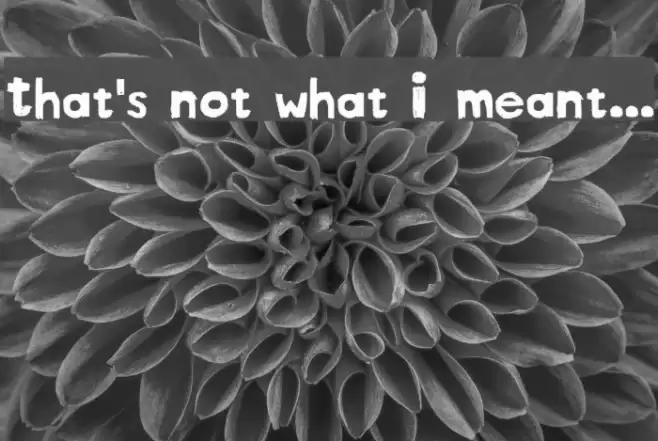
- Proposed Projects: Ideal for posters, album covers, artistic projects, and branding that requires a bold, creative touch.
- Category:
- Bold: Yes
- Italic: No
- Weight: Bold
- Width: Normal
- Character Spacing: Normal
- Contrast: Low
- Overall Style: Artistic, Expressive
- Use Case: Headlines, Posters, Artistic Projects
- Encoding Scheme:
- Is Fixed Pitch: No
Glyphs ! # $ % ( ) * + , - . / 0 1 2 3 4 5 6 7 8 9 : ; = ? @ A B C D E F G H I J K L M N O P Q R S T U V W X Y Z [ ] ^ _ a b c d e f g h i j k l m n o p q r s t u v w x y z { | } ~
That's not what I meant... UPPERCASE
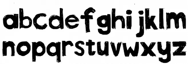
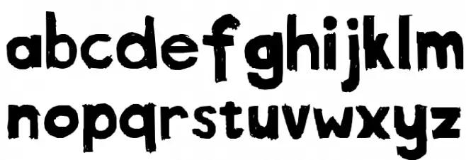
That's not what I meant... LOWERCASE
That's not what I meant... OTHER CHARS
Gallery Examples


Download Free Fonts
Commercial Fonts Fonts
-
 Buy font Thats Amore Commercial Fonts
 -
 Buy font Thataway JNL Regular Commercial Fonts
 -
 Buy font Whatnot Commercial Fonts