The Snow Fell Font

The Snow Fell Description
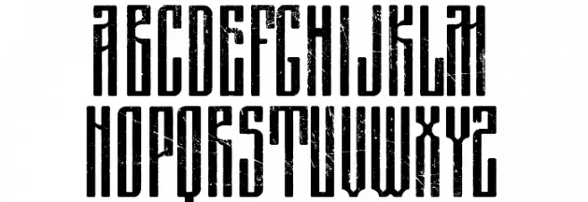
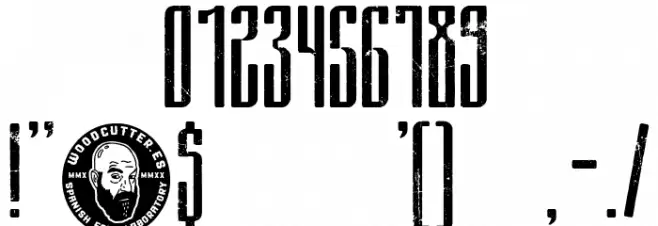
This font features a bold, distressed style with a tall and narrow structure. The characters are elongated with a consistent vertical emphasis, giving them a striking appearance. The distressed texture adds a rugged, vintage feel, making it suitable for designs that require a worn or aged look. The uppercase and lowercase letters maintain a uniform height, contributing to its cohesive and structured appearance. The numerals and special characters follow the same design principles, ensuring consistency across all glyphs.
A bold, distressed, and narrow font with a vintage, rugged appearance from Uncategorized fonts.
- Downloads: 127
- ( Fonts by Woodcutter Manero - http://www.woodcutter.es - Personal-use only. For commercial use please contact owner. FREE )
- Font: The Snow Fell
- Weight:
- Version:
- No. of Characters:: over 20
- Proposed Projects: Ideal for posters, album covers, branding projects, and any design that seeks a vintage or industrial aesthetic.
- Category:
- Bold: Yes
- Italic: No
- Weight: Bold
- Width: Condensed
- Character Spacing: Normal
- Contrast: Low
- Overall Style: Vintage
- Use Case: Headlines, Logos
- Encoding Scheme:
- Is Fixed Pitch: No
Glyphs
The Snow Fell UPPERCASE
The Snow Fell LOWERCASE

The Snow Fell OTHER CHARS
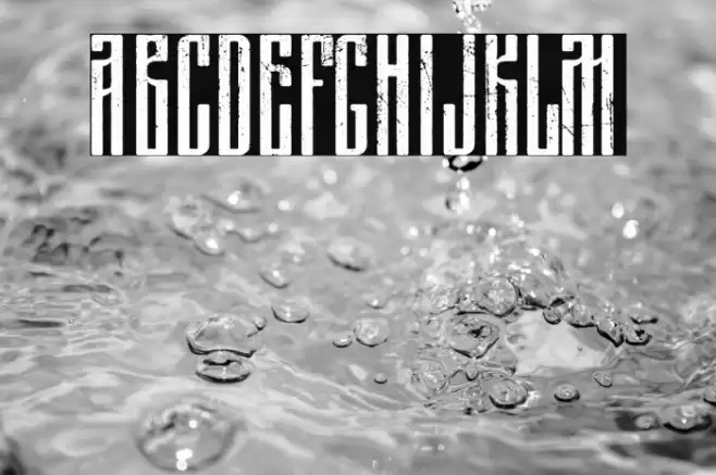
Gallery Examples
Download
127 Downloads
-
 Buy font Fellbaum Grotesk Thin Commercial Fonts
 -
 Buy font Fellbaum Grotesk Thin Italic Commercial Fonts
 -
 Buy font Fellbaum Grotesk Light Commercial Fonts