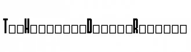
TheHangoverDecadeRegular Font
TheHangoverDecadeRegular Description
This font features a bold and condensed style with a strong vertical emphasis, creating a striking and impactful appearance. The characters are tightly spaced, enhancing the compact and dense look. The uppercase and lowercase letters maintain a consistent height, contributing to a uniform and cohesive design. The numbers and special characters follow the same stylistic approach, ensuring a seamless integration across different text elements. The font's geometric and angular shapes give it a modern and edgy feel, making it suitable for attention-grabbing headlines and titles.
A bold, condensed font with a modern, geometric style from Regular fonts.
- Downloads: 69
- ( Fonts by Daxdu 28 - Personal-use only. For commercial use please contact owner. FREE )
- Font: TheHangoverDecadeRegular
- Weight: Regular
- Version: Version Version 001.000
- No. of Characters:: 40
- Proposed Projects: Ideal for posters, album covers, branding, and any project requiring a bold, modern aesthetic.
- Category:
- Bold: Yes
- Italic: No
- Weight: Bold
- Width: Condensed
- Character Spacing: Tight
- Contrast: Low
- Overall Style: Modern
- Use Case: Headlines, Logos
- Encoding Scheme:
- Is Fixed Pitch: No
Glyphs 0 1 2 3 4 5 6 7 8 9 A B C D E F G H I J K L M N O P Q R S T U V W X Y Z
TheHangoverDecadeRegular UPPERCASE
TheHangoverDecadeRegular LOWERCASE
TheHangoverDecadeRegular OTHER CHARS
Gallery Examples


