Theo Van Doesburg Font
Theo Van Doesburg Description
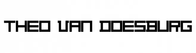
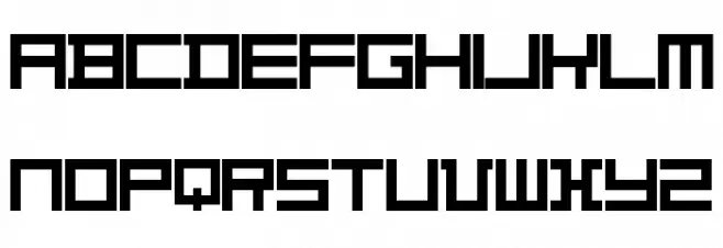
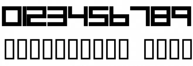
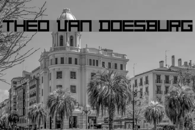
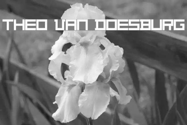
This font features a bold, geometric design with a strong emphasis on straight lines and right angles. The characters are constructed with a uniform stroke width, creating a cohesive and structured appearance. The uppercase letters are particularly striking, with a blocky, architectural feel that suggests a modernist influence. The lowercase letters maintain this geometric style, ensuring consistency across the typeface. Numbers and special characters are designed to match the boldness and angularity of the alphabet, making this font suitable for a variety of applications where a strong visual impact is desired.
A bold, geometric font with uniform stroke width and modernist influence from Futuristic fonts.
- Downloads: 2,544
- THEOVD__.TTF
- Font: Theo Van Doesburg
- Weight: Regular
- Version: Version 4.0
- No. of Characters:: 70
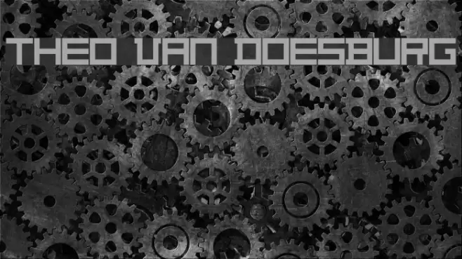
- Proposed Projects: Ideal for architectural designs, modern branding, posters, and digital interfaces.
- Category:
- Bold: Yes
- Italic: No
- Weight: Bold
- Width: Normal
- Character Spacing: Normal
- Contrast: Low
- Overall Style: Modern
- Use Case: Headlines, Logos
- Encoding Scheme:
- Is Fixed Pitch: No
Glyphs 0 1 2 3 4 5 6 7 8 9 ? A B C D E F G H I J K L M N O P Q R S T U V W X Y Z a b c d e f g h i j k l m n o p q r s t u
Theo Van Doesburg UPPERCASE
Theo Van Doesburg LOWERCASE

Theo Van Doesburg OTHER CHARS
Gallery Examples
Download Free Fonts
Commercial Fonts Fonts
-
 Buy font Architype Van Doesburg Commercial Fonts
 -
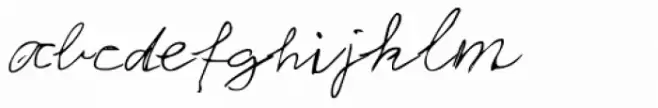 Buy font Theo Handwriting Commercial Fonts
 -
 Buy font NT Theo Regular Commercial Fonts