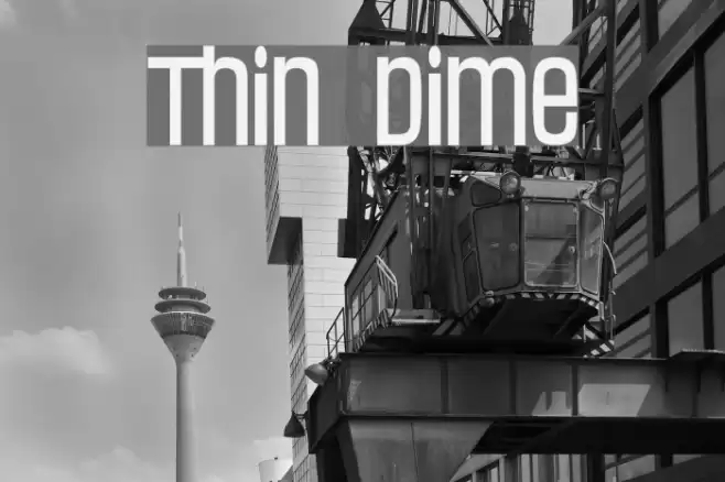
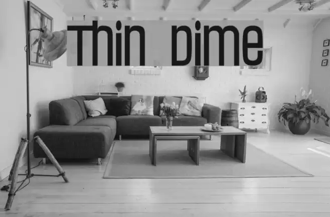
Thin Dime Font

Thin Dime Description
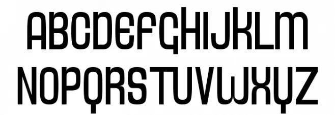
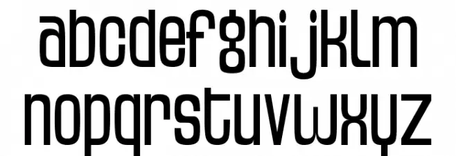
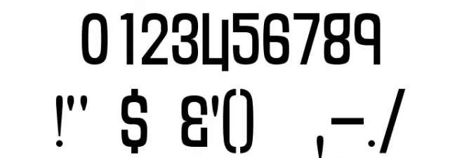
This font features a modern and sleek design with a geometric structure. The characters are uniformly tall and narrow, giving it a condensed appearance. The strokes are consistent in width, contributing to a clean and minimalist look. The uppercase and lowercase letters maintain a harmonious balance, while the numerals and special characters are designed to complement the overall aesthetic. This font is versatile, suitable for both digital and print media, and can be used to create a contemporary and professional impression.
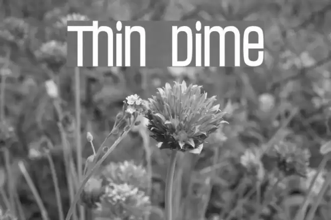
A modern, geometric font with a sleek, condensed design from Futuristic fonts.
- Downloads: 470
- ( Fonts by dartcanada.tripod.com - Darren Rigby FREE )
- THINDIME.TTF
- Font: Thin Dime
- Weight: Regular
- Version: Version Version 1.00, November 11, 2000
- No. of Characters:: 259
- Proposed Projects: Ideal for branding, advertising, web design, and editorial layouts where a modern and professional look is desired.
- Category:
- Bold: No
- Italic: No
- Weight: Regular
- Width: Condensed
- Character Spacing: Normal
- Contrast: Low
- Overall Style: Modern
- Use Case: Headlines, Logos, Web design
- Encoding Scheme:
- Is Fixed Pitch: No
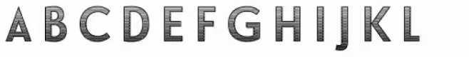
Glyphs ! # $ % ( ) * + , - . / 0 1 2 3 4 5 6 7 8 9 : ; = ? @ A B C D E F G H I J K L M N O P Q R S T U V W X Y Z [ ] ^ _ ` a b c d e f g h i j k l m n o p q r s t u v w x y z { | } ~
Thin Dime UPPERCASE
Thin Dime LOWERCASE
Thin Dime OTHER CHARS
Gallery Examples
Download Free Fonts
Commercial Fonts Fonts
-
 Buy font Dime Lined Commercial Fonts
 -
 Buy font Dime Solid Commercial Fonts
 -
 Buy font Le Havre Layers Dimension Commercial Fonts