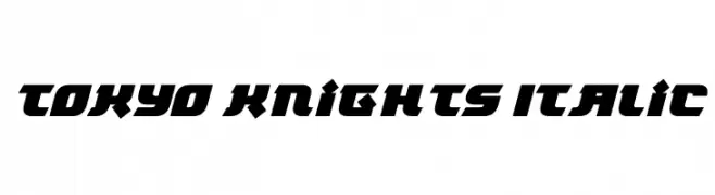
Tokyo Knights Italic Font
Tokyo Knights Italic Description
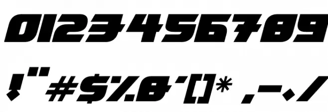
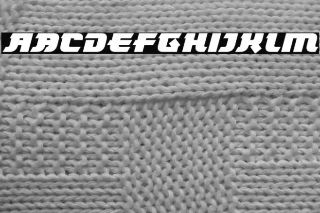
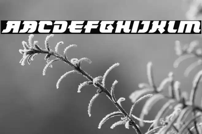
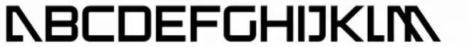
This font features a bold and dynamic design with a futuristic flair, characterized by sharp angles and a strong geometric structure. The italic style adds a sense of motion and speed, making it ideal for projects that require a modern and edgy look. The uppercase and lowercase letters maintain a consistent style, with each character exhibiting a unique angular cut that enhances its distinctiveness. The numbers and special characters follow the same design principles, ensuring uniformity across all elements. The font's bold weight and italic slant make it stand out, while the medium contrast in stroke thickness adds to its readability.
A bold, italic, futuristic font with sharp angles and geometric structure from Uncategorized fonts.
- Downloads: 69
- ( Fonts by Darrell Flood - Personal-use only. For commercial use please contact owner. FREE )
- Font: Tokyo Knights Italic
- Weight:
- Version:
- No. of Characters:: over 20
- Proposed Projects: Ideal for video game titles, tech branding, sports team logos, and sci-fi themed designs.
- Category:
- Bold: Yes
- Italic: Yes
- Weight: Bold
- Width: Normal
- Character Spacing: Normal
- Contrast: Medium
- Overall Style: Modern
- Use Case: Logos, Headlines, Posters
- Encoding Scheme:
- Is Fixed Pitch: No
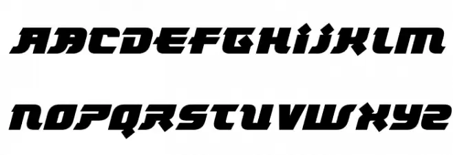
Glyphs
Tokyo Knights Italic UPPERCASE
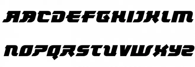
Tokyo Knights Italic LOWERCASE
Tokyo Knights Italic OTHER CHARS
Gallery Examples

Download Free Fonts
-
 Buy font Knightsbridge Regular Commercial Fonts
 -
 Buy font Tokyotrail ExtraLight Commercial Fonts
 -
 Buy font Tokyotrail Bold Commercial Fonts