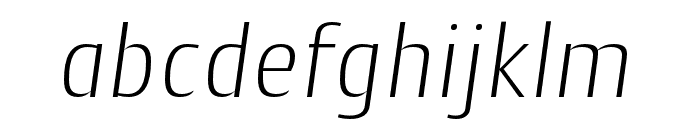
Free Fonts Sans-Serif
VI Quan Tu Font

Do you have the right license?
Having the right license means that you protect yourself from negative legal consequences of not getting proper permissions. Make sure you have the right license by purchasing the individual font or to use a tool like Envato where all fonts are commercially licensed automatically.
General information
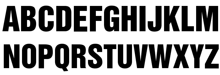
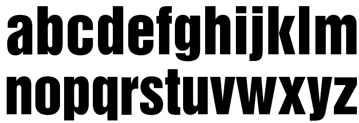
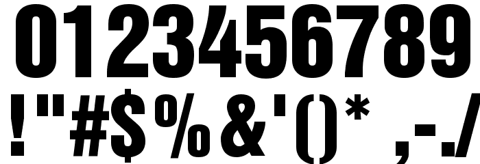
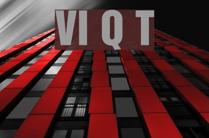
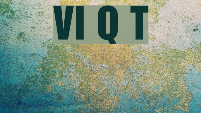
This bold and impactful font features strong, thick strokes that convey a sense of authority and confidence. The uppercase and lowercase letters are designed with a uniform width, creating a cohesive and balanced appearance. The numbers and special characters maintain the same boldness, ensuring consistency across all elements. The font's clean lines and lack of serifs give it a modern and professional look, making it suitable for a variety of design applications. The character spacing is tight, which enhances its bold presence and makes it ideal for attention-grabbing headlines or titles.
A bold, modern sans-serif font with tight spacing and strong, uniform strokes.
- Downloads: 15,885
- QUANTU1T.TTF
- Font: VI Quan Tu
- Weight: Normal
- Version: Version 1.0 Tue Jan 11 11:13:15 1994
- No. of Characters:: 230
- Proposed Projects: Ideal for branding, advertising, posters, and any design requiring a strong visual impact.
- Category: Sans-Serif
- Bold: Yes
- Italic: No
- Weight: Bold
- Width: Normal
- Character Spacing: Tight
- Contrast: Low
- Overall Style: Modern
- Use Case: Headlines, Logos
- Encoding Scheme:
- Is Fixed Pitch: No
Glyphs ! # $ % ( ) * + , - . / 0 1 2 3 4 5 6 7 8 9 : ; = ? @ A B C D E F G H I J K L M N O P Q R S T U V W X Y Z [ ]
UPPERCASE
LOWERCASE
OTHER CHARS
Gallery Examples

Download Free Fonts
-
 SlimSansSerif-Bold Download SlimSansSerif-Bold
 -
OPTIAkrogroteskBlack-Cond Download OPTIAkrogroteskBlack-Cond


Commercial Fonts Fonts
-
Helvetica Pro Inserat Roman Download Helvetica Pro Inserat Roman
Similar free fonts for Helvetica Pro Inserat Roman font -
Helvetica Inserat Cyrillic Download Helvetica Inserat Cyrillic
Similar free fonts for Helvetica Inserat Cyrillic font


Fonts Commercial Fonts
-
Buy font CantigaCnd Black Commercial Fonts
-
Buy font Pill Gothic 300mg Oblique Commercial Fonts
-
Buy font CantigaCnd Bold Italic Commercial Fonts
-
Buy font Pill Gothic 300mg Bold Commercial Fonts
-
Buy font Pill Gothic 300mg Black Commercial Fonts
-
Buy font CantigaCnd ExtraBold Italic Commercial Fonts
-
Buy font Pill Gothic 300mg Black Obliq Commercial Fonts
-
Buy font CantigaCnd ExtraBold Commercial Fonts
-
Buy font Factoria Ultra Commercial Fonts
-
Buy font Factoria Ultra Italic Commercial Fonts
-
Buy font Factoria Thin Commercial Fonts
-
Buy font CantigaCnd ExtraLight Italic Commercial Fonts
-
Buy font Factoria Thin Italic Commercial Fonts
-
Buy font Factoria Medium Commercial Fonts
-
Buy font Factoria Medium Italic Commercial Fonts
-
Buy font CantigaCnd ExtraLight Commercial Fonts
-
Buy font Factoria Light Commercial Fonts
-
Buy font CantigaCnd Light Italic Commercial Fonts