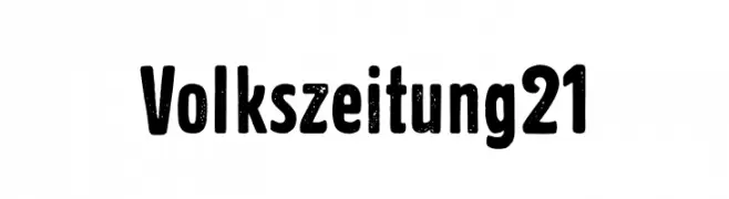
Volkszeitung 21 Font
Volkszeitung 21 Description
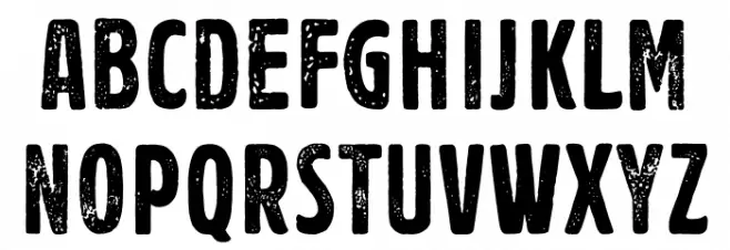
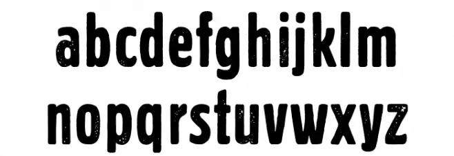
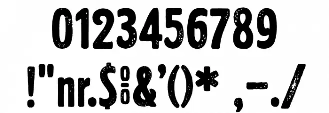
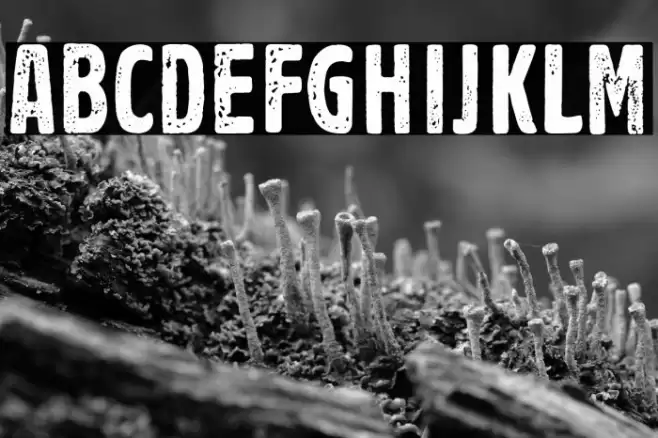
This font features a bold and rugged appearance, characterized by its distressed texture that gives it a vintage, worn-out look. The uppercase and lowercase letters are well-proportioned, with rounded edges that soften the overall aesthetic. The numerals and special characters maintain the same textured style, ensuring consistency across all glyphs. The font's boldness and unique texture make it stand out, while its legibility remains intact, making it suitable for various design applications.
A bold, distressed font with a vintage, textured appearance from Uncategorized fonts.
- Downloads: 135
- ( Fonts by Lukas Krakora - Personal-use only. For commercial use please contact owner. FREE )
- Font: Volkszeitung 21
- Weight:
- Version:
- No. of Characters:: over 20
- Proposed Projects: Ideal for vintage-themed posters, branding for rustic or artisanal products, and eye-catching headlines.
- Category:
- Bold: Yes
- Italic: No
- Weight: Bold
- Width: Normal
- Character Spacing: Normal
- Contrast: Low
- Overall Style: Vintage
- Use Case: Headlines, Logos, Posters
- Encoding Scheme:
- Is Fixed Pitch: No
Glyphs
Volkszeitung 21 UPPERCASE
Volkszeitung 21 LOWERCASE
Volkszeitung 21 OTHER CHARS
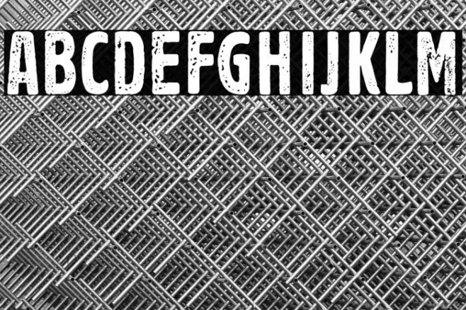
Gallery Examples

Download
135 Downloads
-
 Buy font Univers Next Pro 210 Compressed Thin Commercial Fonts
 -
 Buy font 21st SuperFine Italic Commercial Fonts
 -
 Buy font 21st Regular Commercial Fonts