WHY Font

WHY Description
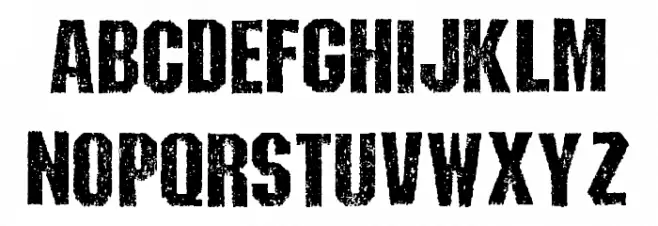
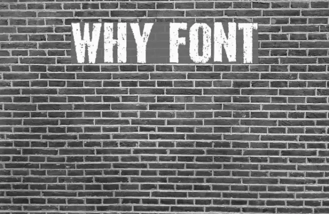
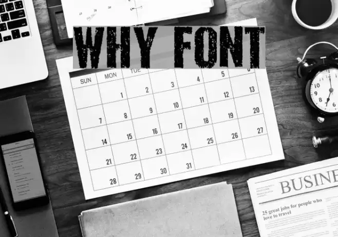
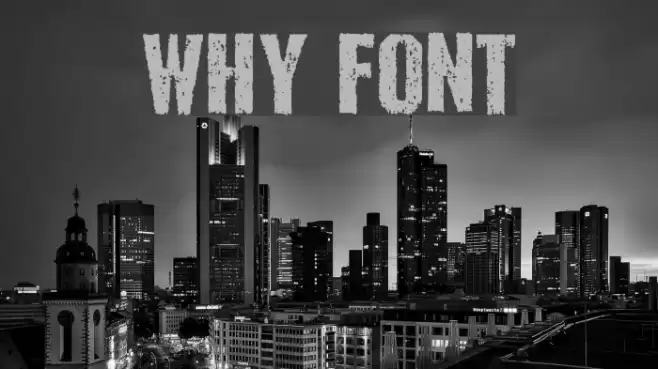
This font features a bold, distressed style with a rugged, textured appearance. The uppercase letters are prominently displayed with a rough, grunge effect that gives them a worn and weathered look. The characters are evenly spaced, maintaining a consistent width throughout. This font is ideal for projects that require a strong, impactful presence, such as posters, album covers, or branding materials that aim to convey a sense of edginess or rebellion. Its unique style makes it stand out, capturing attention with its bold and gritty aesthetic.
A bold, distressed font with a rugged, textured appearance from Images & Symbols fonts.
- Downloads: 218
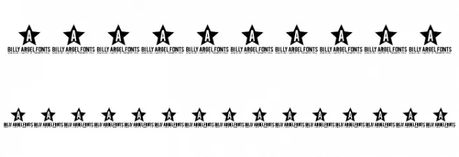
- ( Fonts by Billy Argel - www.billyargel.com - Personal-use only. For commercial use please contact owner. FREE )
- WHY TRIAL.otf
- Font: WHY
- Weight: Regular
- Version: Version 1.000
- No. of Characters:: 67
- Proposed Projects: Ideal for posters, album covers, and edgy branding materials.
- Category:
- Bold: Yes
- Italic: No
- Weight: Bold
- Width: Normal
- Character Spacing: Normal
- Contrast: Medium
- Overall Style: Grunge, Edgy
- Use Case: Headlines, Logos
- Encoding Scheme:
- Is Fixed Pitch: No
Glyphs 0 1 2 3 4 5 6 7 8 9 A B C D E F G H I J K L M N O P Q R S T U V W X Y Z a b c d e f g h i j k l m n o p q r s t u v w x y z
WHY UPPERCASE
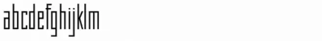
WHY LOWERCASE

WHY OTHER CHARS
Gallery Examples
Download Free Fonts
Commercial Fonts Fonts
-
 Buy font KG Why You Gotta Be So Mean 2 Commercial Fonts
 -
 Buy font KG Why You Gotta Be So Mean Commercial Fonts
 -
 Buy font Why Square Std Thin Commercial Fonts