Fonts
Wars of Asgard Expanded Italic Font
Description
- warasgardei2.ttf
- Font: Wars of Asgard Expanded Italic
- Weight: Expanded Italic
- Version: Version 2
- No. of Characters:: 222
- Encoding Scheme:
- Is Fixed Pitch: 0
Welcome to the Font Trends page — your destination for discovering which fonts are shaping today’s design landscape. Whether you’re working on a brand refresh, social media visuals, or website UI, following current font trends helps your work feel fresh and relevant.
This collection features the most trending fonts of the season, chosen by designers and creators across the world. Expect to see elegant serifs, minimalist sans serifs, expressive display fonts, and handcrafted scripts that define modern aesthetics in 2025.
Combine your favorite trending typefaces with timeless categories like Modern, Serif, or Handwritten for a balanced and eye-catching design.
-
 Download 265 Downloads
 -
( Copyright (c) 2015 Dan Reynolds. )
A classic serif font with modern elegance and balanced proportions.
![Martel Free Fonts Download]() Download 2064 Downloads@WebFont
Download 2064 Downloads@WebFont -
( Fonts by Dieter Steffmann )
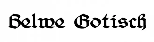
A bold, gothic Blackletter font with intricate detailing and a medieval aesthetic.
![Belwe Gotisch Free Fonts Download]() Download 2716 Downloads@WebFont
Download 2716 Downloads@WebFont -
( Fonts by www.tepidmonkey.net )
A playful, casual handwritten font with dynamic strokes.
![Scott Free Fonts Download]() Download 940 Downloads@WebFont
Download 940 Downloads@WebFont -
( Fonts by Nick Curtis - www.nicksfonts.com )
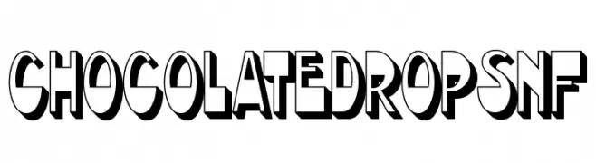
A bold, playful font with a 3D shadow effect, perfect for dynamic and fun designs.
![ChocolateDropsNF Free Fonts Download]() Download 1000 Downloads@WebFont
Download 1000 Downloads@WebFont -
![Party Hats Free Fonts Download]() Download 235 Downloads@WebFont
Download 235 Downloads@WebFont -
( Fonts by www.fenotype.com )
A bold, 3D-effect font with a modern and playful style.
![10.10 Free Fonts Download]() Download 16442 Downloads@WebFont
Download 16442 Downloads@WebFont -
![Oldchristmas Regular Free Fonts Download]() Download 4166 Downloads@WebFont
Download 4166 Downloads@WebFont


FAQ — Font Trends
What are the current font trends?
Simplicity, legibility, and warmth dominate: rounded sans serifs, high-contrast serifs, and tasteful retro revivals are everywhere — clean but human.
Which fonts are trending in design right now?
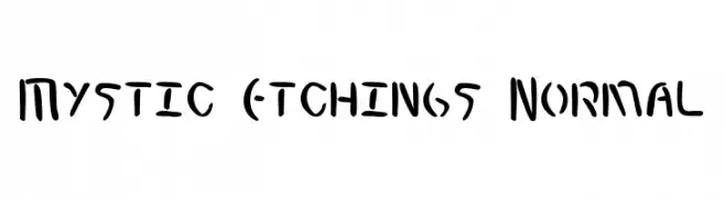
Popular choices include Mystic Etchings Normal, Martel, Belwe Gotisch, Scott and ChocolateDropsNF — fonts known for their balance between modern and timeless. They look great on web pages, social content, and packaging, bringing a clean yet expressive feel.
How do I use trending fonts in my projects?
Use one standout display font for titles and pair it with a simple sans serif for body text. This creates contrast without losing readability. Always test how your chosen font trend performs across screen sizes and branding materials before finalizing.
💡 Tip: Refresh key assets every few months with a new trending font to keep visuals sharp and discoverable.