WhitbyBrewers Font
WhitbyBrewers Description
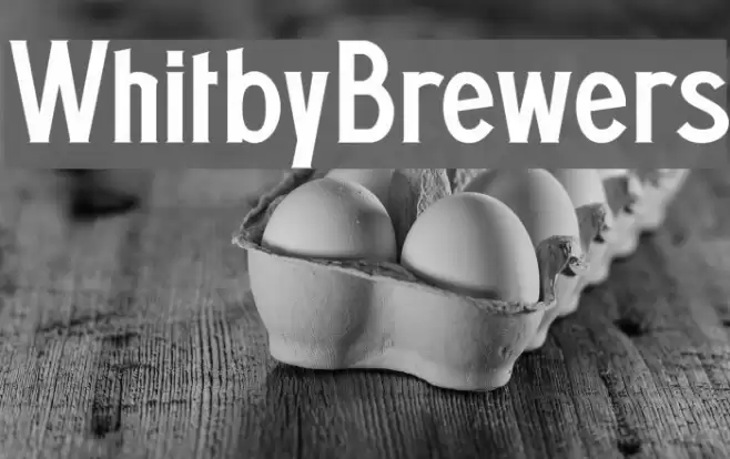
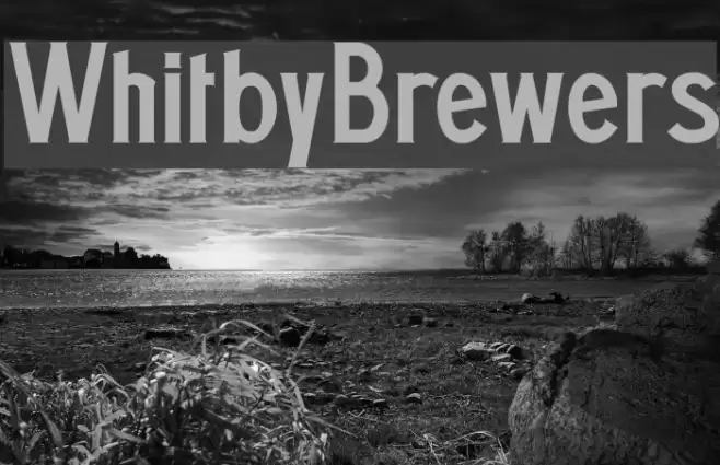
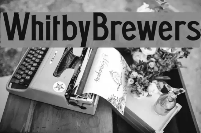
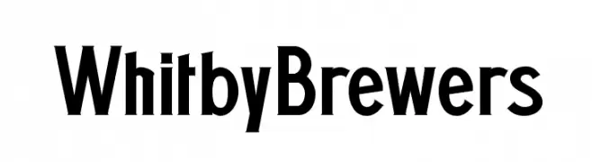
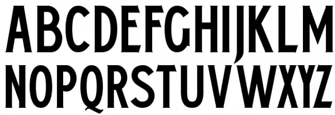
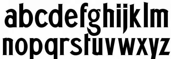
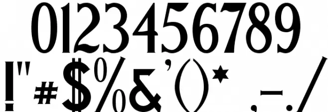
This font features a bold and striking design with a strong presence. The uppercase letters are tall and narrow, giving a sense of elegance and authority. The lowercase letters maintain a consistent style, with some unique characteristics such as the curved tail on the 'g' and the distinctive shape of the 't'. The numerals are clear and easy to read, with a uniform thickness that matches the letters. Special characters are designed to complement the overall aesthetic, providing a cohesive look. This font is well-suited for projects that require a bold statement, such as branding or advertising.
A bold, elegant font with tall, narrow uppercase letters and distinctive lowercase features from Thick fonts.
- Downloads: 397
- ( Fonts by a Pilaster Davy . Personal-use only. For commercial use please contact owner. FREE )
- WhitbyBrewers.otf
- Font: WhitbyBrewers
- Weight: Regular
- Version: Version 001.000
- No. of Characters:: 234
- Proposed Projects: Ideal for branding, advertising, poster design, and any project requiring a strong visual impact.
- Category:
- Bold: Yes
- Italic: No
- Weight: Bold
- Width: Condensed
- Character Spacing: Normal
- Contrast: Medium
- Overall Style: Modern
- Use Case: Headlines, Logos, Posters
- Encoding Scheme:
- Is Fixed Pitch: No
Glyphs ! # $ % ( ) * + , - . / 0 1 2 3 4 5 6 7 8 9 : ; = ? @ A B C D E F G H I J K L M N O P Q R S T U V W X Y Z [ ] ^ _ ` a b c d e f g h i j k l m n o p q r s t u v w x y z { | } ~ ı ˇ ˙ ˛ ‱ ℓ № ℮
WhitbyBrewers UPPERCASE
WhitbyBrewers LOWERCASE
WhitbyBrewers OTHER CHARS
Gallery Examples