Fonts
Wrong time, wrong place Font
Description
- Wrong time, wrong place.ttf
- Font: Wrong time, wrong place
- Weight: Regular
- Version: Version Version 1.00 November 18, 2014, initial release
- No. of Characters:: 653
- Encoding Scheme:
- Is Fixed Pitch: 0
Welcome to the Font Trends page — your destination for discovering which fonts are shaping today’s design landscape. Whether you’re working on a brand refresh, social media visuals, or website UI, following current font trends helps your work feel fresh and relevant.
This collection features the most trending fonts of the season, chosen by designers and creators across the world. Expect to see elegant serifs, minimalist sans serifs, expressive display fonts, and handcrafted scripts that define modern aesthetics in 2025.
Combine your favorite trending typefaces with timeless categories like Modern, Serif, or Handwritten for a balanced and eye-catching design.
-
( Fonts by Apostrophic Lab )
A bold, angular font with a geometric and impactful design.
 Download 251 Downloads@WebFont
 -
( Fonts by Jacob Fisher - www.pizzadude.dk )
A futuristic, geometric font with bold, interconnected lines and a three-dimensional appearance.
![Iron Lounge Smart Free Fonts Download]() Download 239 Downloads@WebFont
Download 239 Downloads@WebFont -
![Ribbons 2 Free Fonts Download]() Download 1400 Downloads@WebFont
Download 1400 Downloads@WebFont -
![Clip Font Caps Free Fonts Download]() Download 372 Downloads
Download 372 Downloads -
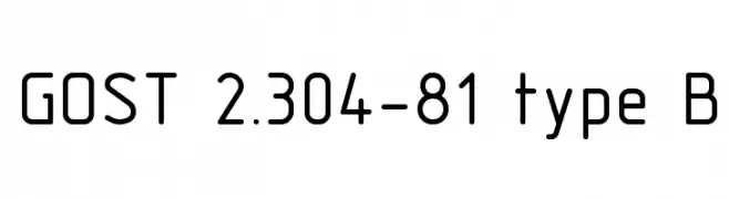
![GOST 2.304-81 type B Free Fonts Download]() Download 8528 Downloads@WebFont
Download 8528 Downloads@WebFont -
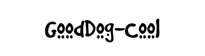
( Fonts by www.fonthead.com )
A playful, handwritten font with bold, rounded characters.
![GoodDog-Cool Free Fonts Download]() Download 4839 Downloads@WebFont
Download 4839 Downloads@WebFont -
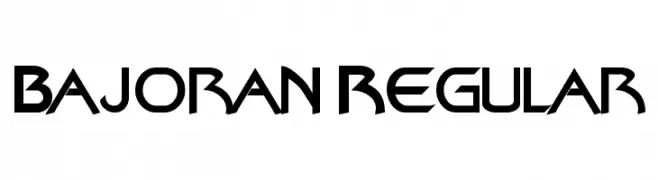
( Fonts by www.alphabetype.it )
A futuristic, angular font with sharp edges and geometric forms.
![Bajoran Regular Free Fonts Download]() Download 2189 Downloads@WebFont
Download 2189 Downloads@WebFont -
![Armageddon Free Fonts Download]() Download 1590 Downloads@WebFont
Download 1590 Downloads@WebFont
FAQ — Font Trends
What are the current font trends?
Simplicity, legibility, and warmth dominate: rounded sans serifs, high-contrast serifs, and tasteful retro revivals are everywhere — clean but human.
Which fonts are trending in design right now?
Popular choices include Konfuciuz Fat, Iron Lounge Smart, Ribbons 2, Clip Font Caps and GOST 2.304-81 type B — fonts known for their balance between modern and timeless. They look great on web pages, social content, and packaging, bringing a clean yet expressive feel.
How do I use trending fonts in my projects?
Use one standout display font for titles and pair it with a simple sans serif for body text. This creates contrast without losing readability. Always test how your chosen font trend performs across screen sizes and branding materials before finalizing.
💡 Tip: Refresh key assets every few months with a new trending font to keep visuals sharp and discoverable.