Free Fonts Decorative/Display
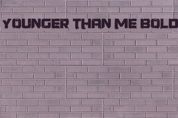
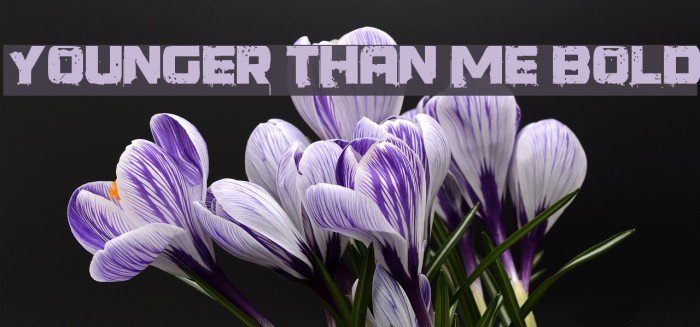
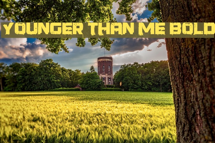
Younger than me Bold Font

Do you have the right license?
Having the right license means that you protect yourself from negative legal consequences of not getting proper permissions. Make sure you have the right license by purchasing the individual font or to use a tool like Envato where all fonts are commercially licensed automatically.
General information
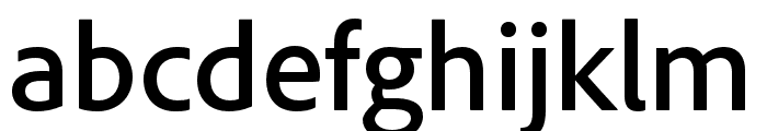
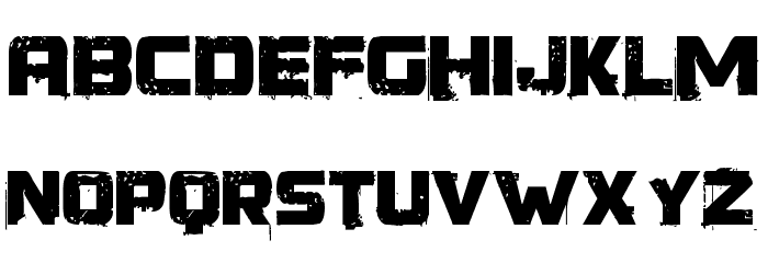
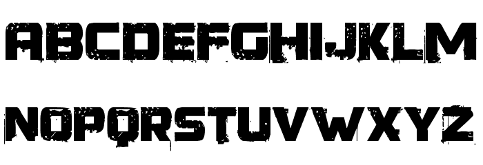
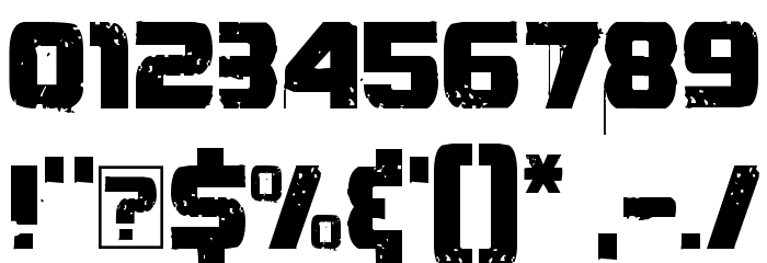
This font features a bold, distressed style with a rugged, textured appearance. Each character is designed with a rough, grunge effect, giving it a worn and weathered look. The uppercase letters are prominent and impactful, making them ideal for attention-grabbing headlines. The numbers and special characters maintain the same distressed aesthetic, ensuring consistency across all text elements. This font's unique style is perfect for projects that require a bold statement or an edgy, urban feel.
A bold, distressed font with a rugged, textured appearance.
- Downloads: 803
- ( Fonts by Koczman Balint - magiquefonts.gportal.hu FREE )
- Younger than me.ttf
- Font: Younger than me Bold
- Weight: Bold
- Version: Version Version 1.00 March 20, 2009, initial release
- No. of Characters:: 164
- Proposed Projects: Ideal for posters, album covers, streetwear branding, and any design needing an edgy, urban vibe.
- Category: Decorative/Display
- Bold: Yes
- Italic: No
- Weight: Bold
- Width: Normal
- Character Spacing: Normal
- Contrast: Low
- Overall Style: Decorative
- Use Case: Headlines, Logos
- Encoding Scheme:
- Is Fixed Pitch: No
Glyphs ! $ % ( ) * + , - . / 0 1 2 3 4 5 6 7 8 9 : ; = ? @ A B C D E F G H I J K L M N O P Q R S T U V W X Y Z [ ] ^ _ a b c d e f g h i j k l m n o p q r s t u v w x y z { | }
UPPERCASE
LOWERCASE
OTHER CHARS
Gallery Examples
Download Free Fonts
-
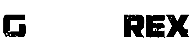
 Generator REX Download Generator REX
 -
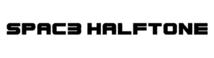
Spac3 halftone Download Spac3 halftone
Commercial Fonts Fonts
-
-
Apnea Inline Fill Print Download Apnea Inline Fill Print
Similar free fonts for Apnea Inline Fill Print font


Fonts Commercial Fonts
-
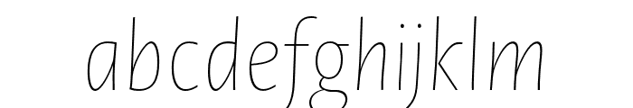
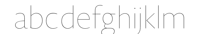
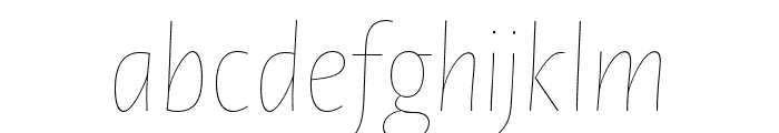
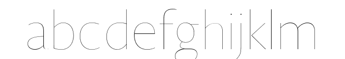
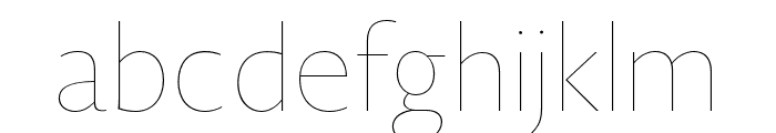
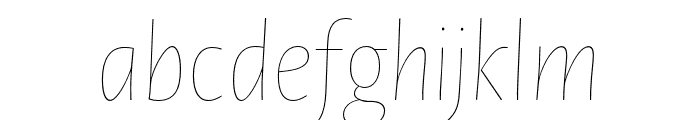
Buy font Novel Sans Hair Pro XCmp 24 It Commercial Fonts
-
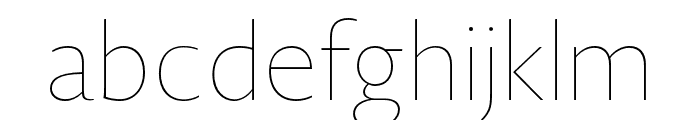
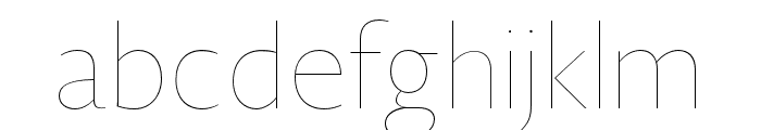
Buy font Novel Sans Hair Pro XCmp 18 Commercial Fonts
-
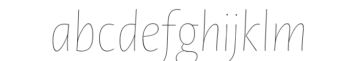
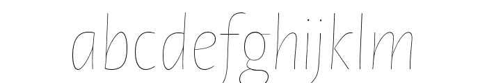
Buy font Novel Sans Hair Pro XCmp 18 It Commercial Fonts
-
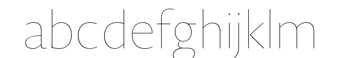
Buy font Novel Sans Hair Pro XCmp 14 Commercial Fonts
-
Buy font Novel Sans Hair Pro XCmp 14 It Commercial Fonts
-
Buy font Novel Sans Hair Pro XCmp 12 Commercial Fonts
-
Buy font Novel Sans Hair Pro XCmp 12 It Commercial Fonts
-
Buy font Novel Sans Hair Pro XCmp 10 Commercial Fonts
-
Buy font Novel Sans Hair Pro XCmp 10 It Commercial Fonts
-
Buy font Novel Sans Hair Pro Cnd 8 Commercial Fonts
-
Buy font Novel Sans Hair Pro Cnd 8 It Commercial Fonts
-
Buy font Novel Sans Hair Pro Cnd 6 Commercial Fonts
-
Buy font Novel Sans Hair Pro Cnd 6 It Commercial Fonts
-
Buy font Novel Sans Hair Pro Cnd 54 Commercial Fonts
-
Buy font Novel Sans Hair Pro Cnd 54 It Commercial Fonts
-
Buy font Novel Sans Hair Pro Cnd 48 Commercial Fonts
-
Buy font Novel Sans Hair Pro Cnd 48 It Commercial Fonts
-
Buy font Novel Sans Hair Pro Cnd 42 Commercial Fonts