brasil 2014 Font
brasil 2014 Description
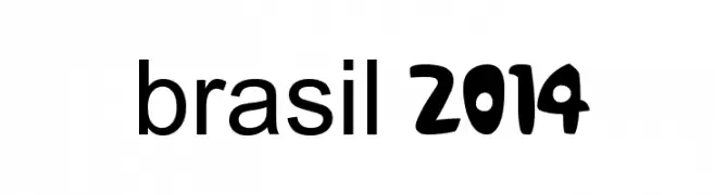
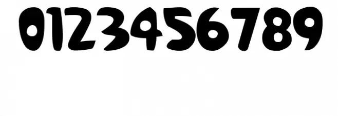
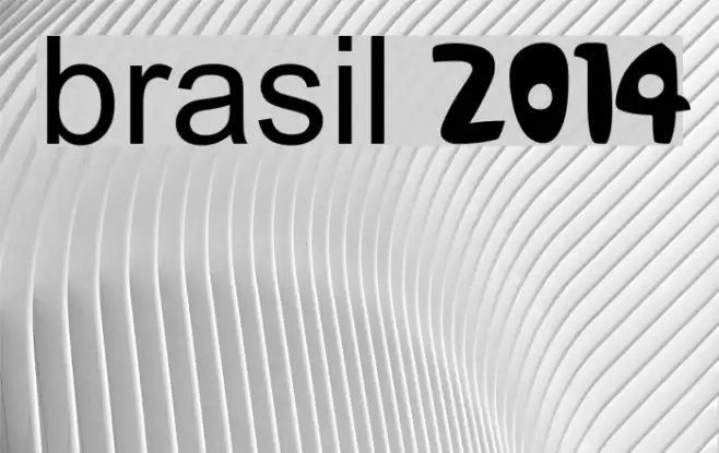
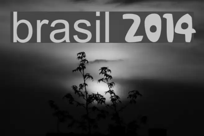
This font features a playful and bold design, characterized by its rounded edges and thick strokes. The uppercase letters are uniform in height, while the lowercase letters maintain a consistent baseline, creating a cohesive look. The numbers are distinct with a slightly exaggerated curvature, adding to the font's whimsical nature. The overall style is modern and approachable, making it suitable for a variety of creative applications. The font's unique personality is further enhanced by its wide character spacing, which ensures readability and impact.
A playful, bold font with rounded edges and wide spacing from Handwritten fonts.
- Downloads: 5,995
- brasil 2014 numeros.ttf
- Font: brasil 2014
- Weight: Regular
- Version: Version Version 1.00 October 1, 2012, initial release
- No. of Characters:: 236
- Proposed Projects: Ideal for children's books, playful branding, event posters, and merchandise design.
- Category:
- Bold: Yes
- Italic: No
- Weight: Bold
- Width: Normal
- Character Spacing: Wide
- Contrast: Low
- Overall Style: Modern
- Use Case: Headlines, Logos
- Encoding Scheme:
- Is Fixed Pitch: No
Glyphs ! # $ % ( ) * + , - . / 0 1 2 3 4 5 6 7 8 9 : ; = ? @ A B C D E F G H I J K L M N O P Q R S T U V W X Y Z [ ] ^ _ ` a b c d e f g h i j k l m n o p q r s t u v w x y z { | } ~
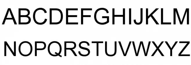
brasil 2014 UPPERCASE
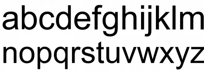
brasil 2014 LOWERCASE
brasil 2014 OTHER CHARS
Gallery Examples
Download Free Fonts
Commercial Fonts Fonts
-
 Buy font Brasilica SemiBold Commercial Fonts
 -
 Buy font Brasilica Black Commercial Fonts
 -
 Buy font Brasilica Medium Commercial Fonts