lack-of-luck Font

lack-of-luck Description
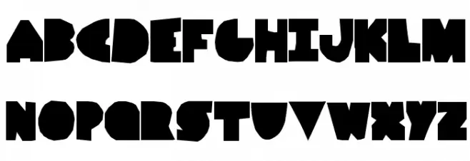
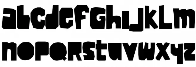
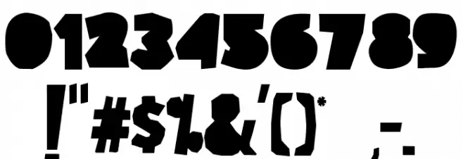
This font features a bold and chunky style with a playful and irregular shape to each character. The letters are heavily stylized, with a blocky appearance that gives them a distinct, almost cartoonish look. The uppercase and lowercase letters maintain a consistent weight, contributing to a cohesive visual impact. The numbers and special characters follow the same design principles, ensuring uniformity across all glyphs. This font's unique design makes it stand out, with its bold presence and artistic flair.
A bold, chunky, and playful font with irregular, blocky shapes from Cartoon fonts.
- Downloads: 168
- lack-of-luck.ttf
- Font: lack-of-luck
- Weight: Regular
- Version: Version Version 1.00 May 9, 2014, initial release
- No. of Characters:: 236
- Proposed Projects: Ideal for children's books, comic strips, playful branding, posters, and creative projects requiring a fun and bold typeface.
- Category:
- Bold: Yes
- Italic: No
- Weight: Bold
- Width: Normal
- Character Spacing: Normal
- Contrast: Low
- Overall Style: Decorative
- Use Case: Headlines, Logos, Posters
- Encoding Scheme:
- Is Fixed Pitch: No
Glyphs ! # $ % ( ) * + , - . / 0 1 2 3 4 5 6 7 8 9 : ; = ? @ A B C D E F G H I J K L M N O P Q R S T U V W X Y Z [ ] ^ _ ` a b c d e f g h i j k l m n o p q r s t u v w x y z { | } ~
lack-of-luck UPPERCASE
lack-of-luck LOWERCASE
lack-of-luck OTHER CHARS
Gallery Examples


Download Free Fonts
Commercial Fonts Fonts
-
 Buy font Mr Lackboughs Commercial Fonts
 -
 Buy font Luckmeister PB Commercial Fonts
 -
 Buy font Luckiest Softie Pro Commercial Fonts