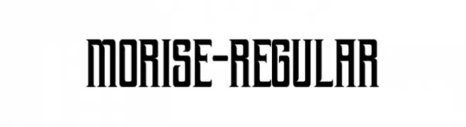
morise-Regular Font
morise-Regular Description
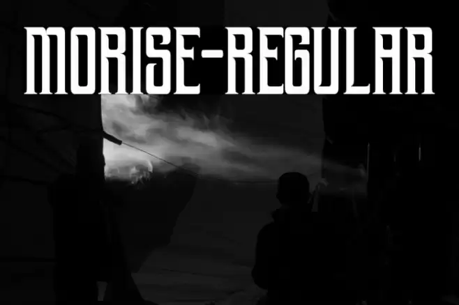
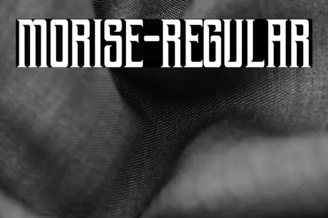
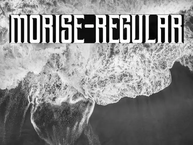
This font features a bold and striking design with a strong presence. The characters are tall and narrow, giving it a condensed appearance. The vertical strokes are prominent, with minimal contrast between thick and thin lines, creating a uniform look. The serifs are sharp and angular, adding a touch of elegance and sophistication. The overall style is modern yet classic, making it versatile for various design applications. The numerals and special characters maintain the same boldness and clarity, ensuring consistency across all text elements.
A bold, condensed serif font with sharp, angular serifs and minimal contrast from Regular fonts.
- Downloads: 110
- ( Fonts by Handpik - Personal-use only. For commercial use please contact owner. FREE )
- Font: morise-Regular
- Weight: Regular
- Version: Version 1.000
- No. of Characters:: 179
- Proposed Projects: Ideal for headlines, posters, branding, and logo design where a strong visual impact is needed.
- Category:
- Bold: Yes
- Italic: No
- Weight: Bold
- Width: Condensed
- Character Spacing: Tight
- Contrast: Low
- Overall Style: Modern
- Use Case: Headlines, Logos
- Encoding Scheme:
- Is Fixed Pitch: No
Glyphs ! # $ % ( ) * + , - . / 0 1 2 3 4 5 6 7 8 9 : ; = ? @ A B C D E F G H I J K L M N O P Q R S T U V W X Y Z [ ] ^ _ ` a b c d e f g h i j k l m n o p q r s t u v w x y z { | } ~ ı Ž ž ˇ ˘ ˙ ˚ ˛ ˝
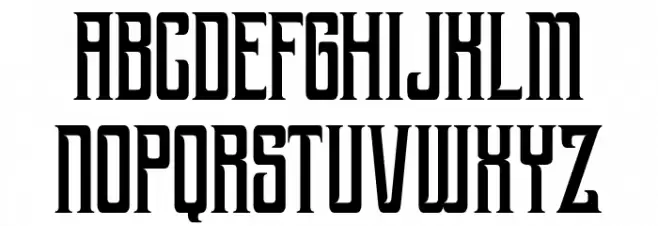
morise-Regular UPPERCASE
morise-Regular LOWERCASE
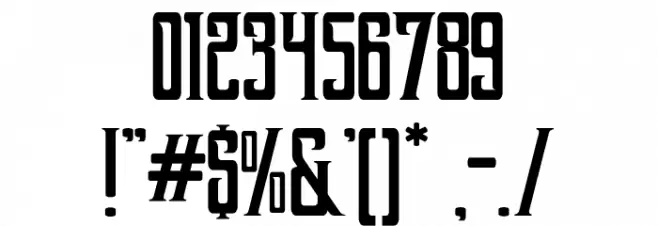
morise-Regular OTHER CHARS
Gallery Examples
-
 Buy font Apollonius Regular Commercial Fonts
 -
 Buy font Dinghybats Regular Commercial Fonts
 -
 Buy font Dinghy Regular Commercial Fonts