my_goth_is better Font
my_goth_is better Description
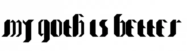
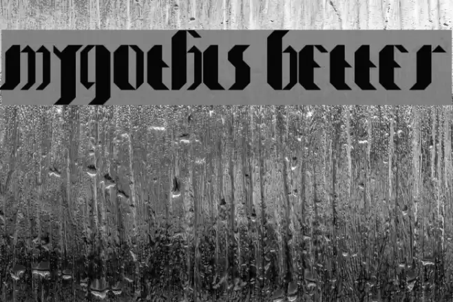
This font features a bold, angular design reminiscent of traditional Blackletter styles. The characters are sharply defined with thick strokes and pointed edges, creating a dramatic and impactful appearance. The uppercase and lowercase letters maintain a consistent style, with a strong vertical emphasis and intricate detailing. The font's unique aesthetic is both historical and modern, making it suitable for projects that require a touch of elegance and authority. The spacing between characters is tight, enhancing the cohesive look of the text.
A bold, angular Blackletter-style font with dramatic strokes from Gothic fonts.
- Downloads: 145
- my_goth_is__better.ttf
- Font: my_goth_is better
- Weight: my_goth_is better
- Version: Version Version 1.000
- No. of Characters:: 56
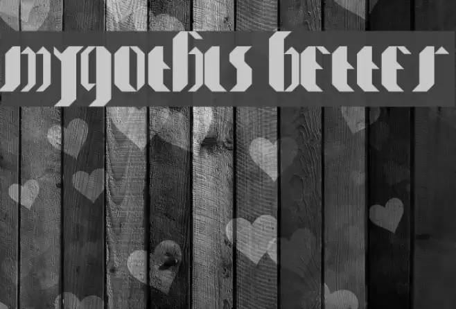
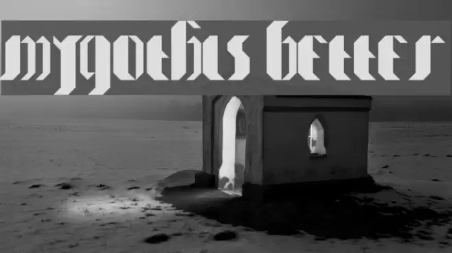
- Proposed Projects: Ideal for use in branding, posters, book covers, and any design that seeks to evoke a sense of tradition and strength.
- Category:
- Bold: Yes
- Italic: No
- Weight: Bold
- Width: Normal
- Character Spacing: Tight
- Contrast: High
- Overall Style: Classic
- Use Case: Logos, Headlines, Decorative text
- Encoding Scheme:
- Is Fixed Pitch: No
Glyphs A B C D E F G H I J K L M N O P Q R S T U V W X Y Z a b c d e f g h i j k l m n o p q r s t u v w x y z
my_goth_is better UPPERCASE

my_goth_is better LOWERCASE
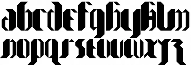
my_goth_is better OTHER CHARS

Gallery Examples
Download Free Fonts
Commercial Fonts Fonts
-
 Buy font KG Two Is Better Than One Commercial Fonts
 -
 Buy font Better Together Caps Commercial Fonts
 -
 Buy font Better Together Script Commercial Fonts