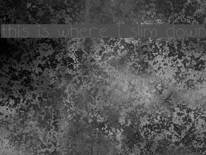
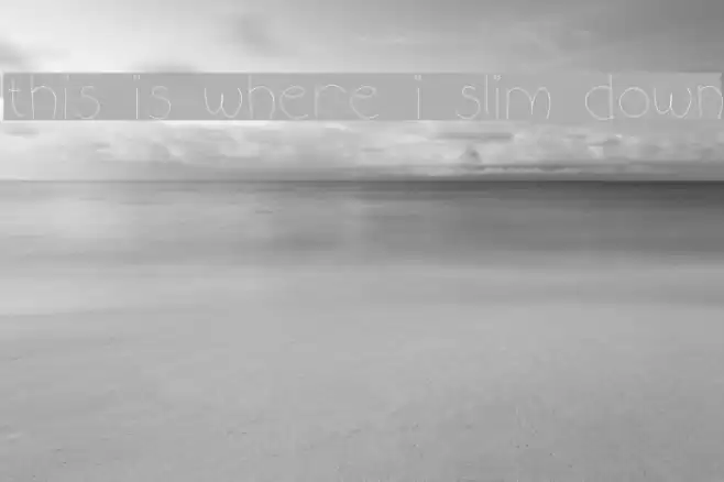
this is where i slim down Font
this is where i slim down Description
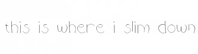
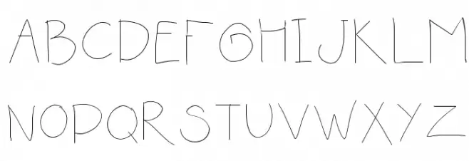
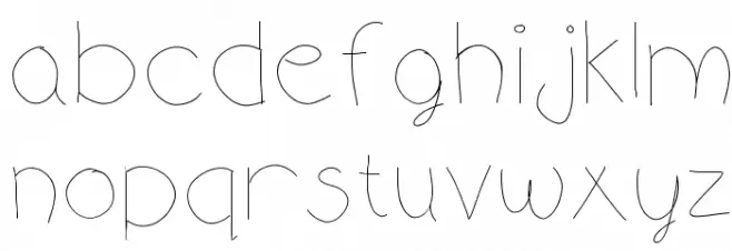
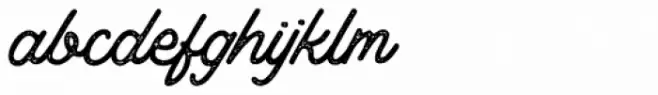
This font features a playful and whimsical design with thin, delicate strokes that give it a light and airy feel. The characters are slightly irregular, adding a hand-drawn, organic touch to the overall appearance. The uppercase letters are tall and slender, while the lowercase letters maintain a consistent height, creating a harmonious balance. Numbers and special characters follow the same thin, whimsical style, making them blend seamlessly with the alphabet. The font's unique personality makes it suitable for creative and informal projects, where a touch of individuality is desired.
A playful, thin, and whimsical font with a hand-drawn feel from Uncategorized fonts.
- Downloads: 137
- this is where i slim down i guess.ttf
- Font: this is where i slim down
- Weight: Medium
- Version: Version Version 1.0
- No. of Characters:: 87
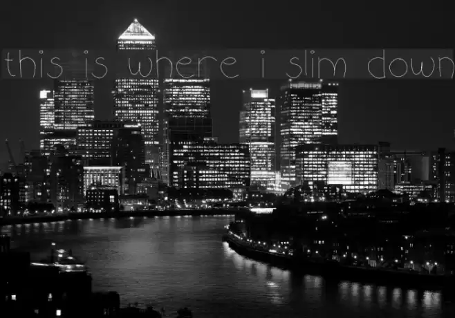
- Proposed Projects: Ideal for greeting cards, children's books, creative posters, and playful branding.
- Category:
- Bold: No
- Italic: No
- Weight: Light
- Width: Normal
- Character Spacing: Normal
- Contrast: Low
- Overall Style: Playful
- Use Case: Headlines, Creative projects
- Encoding Scheme:
- Is Fixed Pitch: No
Glyphs ! # ( ) + , - . / 0 1 2 3 4 5 6 7 8 9 : ; = ? @ A B C D E F G H I J K L M N O P Q R S T U V W X Y Z a b c d e f g h i j k l m n o p q r s t u v w x y z
this is where i slim down UPPERCASE
this is where i slim down LOWERCASE
this is where i slim down OTHER CHARS

Gallery Examples
Download Free Fonts
Commercial Fonts Fonts
-
 Buy font Thistle Borders Commercial Fonts
 -
 Buy font Thistails Font Duo Sricpt Regular Commercial Fonts
 -
 Buy font Thistails Font Duo Script Rough Commercial Fonts