Fonts
vtks white page 3d Font
Description
- vtks white page 3d.ttf
- Font: vtks white page 3d
- Weight: Regular
- Version: Version Version 1.00 July 5, 2009, initial release
- No. of Characters:: 679
- Encoding Scheme:
- Is Fixed Pitch: 0
Welcome to the Font Trends page — your destination for discovering which fonts are shaping today’s design landscape. Whether you’re working on a brand refresh, social media visuals, or website UI, following current font trends helps your work feel fresh and relevant.
This collection features the most trending fonts of the season, chosen by designers and creators across the world. Expect to see elegant serifs, minimalist sans serifs, expressive display fonts, and handcrafted scripts that define modern aesthetics in 2025.
Combine your favorite trending typefaces with timeless categories like Modern, Serif, or Handwritten for a balanced and eye-catching design.
-
( Fonts by Alan Carr )
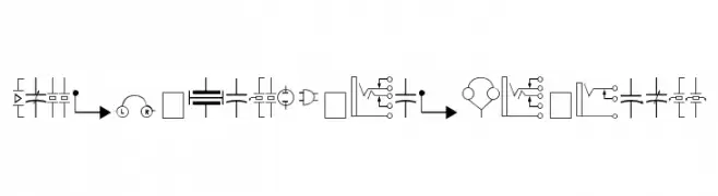
A comprehensive set of electronic component symbols for technical diagrams.
 Download 2635 Downloads@WebFont
 -
( Fonts by Klaus Johansen - www.listemageren.dK )
A playful, domino-themed font with italicized, outlined characters.
![Domino flad kursiv omrids Free Fonts Download]() Download 225 Downloads@WebFont
Download 225 Downloads@WebFont -
![Twee Free Fonts Download]() Download 154 Downloads@WebFont
Download 154 Downloads@WebFont -
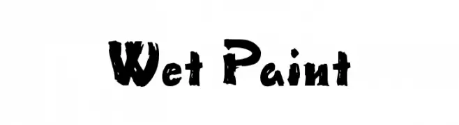
![Wet Paint Free Fonts Download]() Download 3618 Downloads@WebFont
Download 3618 Downloads@WebFont -
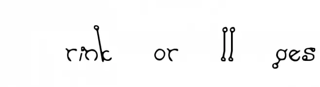
![A Drink For All Ages Free Fonts Download]() Download 894 Downloads@WebFont
Download 894 Downloads@WebFont -
![Summers Country Jars Free Fonts Download]() Download 212 Downloads@WebFont
Download 212 Downloads@WebFont -
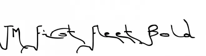
![TM First Fleet Bold Free Fonts Download]() Download 215 Downloads@WebFont
Download 215 Downloads@WebFont -
( Fonts by Jacob Fisher - www.pizzadude.dk )
A pixelated, retro-style font with a digital display aesthetic.
![Exit font [for a film] Free Fonts Download]() Download 398 Downloads@WebFont
Download 398 Downloads@WebFont


![Exit font [for a film] Free Fonts Download](https://d144mzi0q5mijx.cloudfront.net/img/E/X/Exit-font-for-a-film.webp)
FAQ — Font Trends
What are the current font trends?
Simplicity, legibility, and warmth dominate: rounded sans serifs, high-contrast serifs, and tasteful retro revivals are everywhere — clean but human.
Which fonts are trending in design right now?
Popular choices include Carr Electronic Dingbats, Domino flad kursiv omrids, Twee, Wet Paint and A Drink For All Ages — fonts known for their balance between modern and timeless. They look great on web pages, social content, and packaging, bringing a clean yet expressive feel.
How do I use trending fonts in my projects?
Use one standout display font for titles and pair it with a simple sans serif for body text. This creates contrast without losing readability. Always test how your chosen font trend performs across screen sizes and branding materials before finalizing.
💡 Tip: Refresh key assets every few months with a new trending font to keep visuals sharp and discoverable.