xe Callig Better Regular Font

xe Callig Better Regular Description
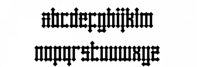
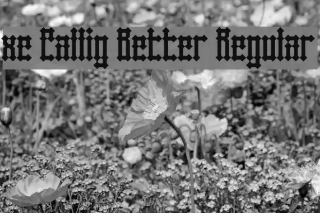
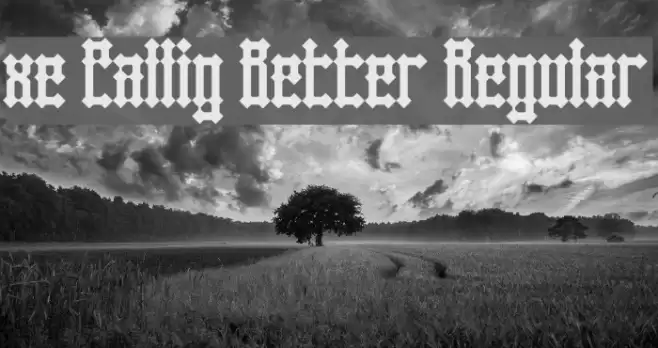
This font exhibits a bold and intricate design reminiscent of traditional blackletter styles. Each character is crafted with sharp, angular lines and a high level of detail, giving it a distinct, medieval appearance. The uppercase and lowercase letters maintain a consistent style, with ornate flourishes and a strong vertical emphasis. The numbers and special characters are equally elaborate, ensuring a cohesive look across all glyphs. This font's dramatic and historical aesthetic makes it suitable for projects that require a touch of elegance and tradition.
A bold, intricate blackletter font with a medieval aesthetic from Uncategorized fonts.
- Downloads: 182
- xe_callig_better.ttf
- Font: xe Callig Better Regular
- Weight: Regular
- Version: Version Version 1.0
- No. of Characters:: 85
- Proposed Projects: Ideal for historical documents, event invitations, book covers, and branding that requires a classic or gothic touch.
- Category:
- Bold: Yes
- Italic: No
- Weight: Bold
- Width: Normal
- Character Spacing: Normal
- Contrast: High
- Overall Style: Vintage
- Use Case: Headlines, Logos
- Encoding Scheme:
- Is Fixed Pitch: No
Glyphs ! , . 0 1 2 3 4 5 6 7 8 9 ? A B C D E F G H I J K L M N O P Q R S T U V W X Y Z a b c d e f g h i j k l m n o p q r s t u v w x y z
xe Callig Better Regular UPPERCASE
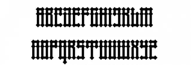
xe Callig Better Regular LOWERCASE
xe Callig Better Regular OTHER CHARS

Gallery Examples

Download Free Fonts
Commercial Fonts Fonts
-
 Buy font Xero Xero Commercial Fonts
 -
 Buy font KG Two Is Better Than One Commercial Fonts
 -
 Buy font Better Together Caps Commercial Fonts