Free Fonts Decorative/Display
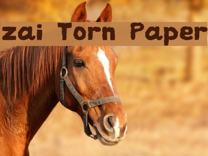
zai Torn Paper Font

Do you have the right license?
Having the right license means that you protect yourself from negative legal consequences of not getting proper permissions. Make sure you have the right license by purchasing the individual font or to use a tool like Envato where all fonts are commercially licensed automatically.
General information
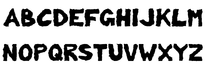
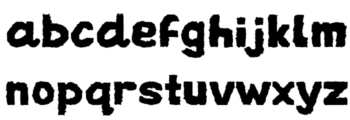
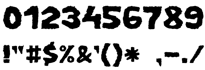
This font features a rugged, torn paper effect that gives it a unique and textured appearance. The characters are bold and slightly irregular, mimicking the look of letters cut from paper with rough edges. This style creates a sense of movement and dynamism, making it stand out in any design. The uppercase and lowercase letters maintain a consistent style, while the numbers and special characters follow the same torn aesthetic. The font's playful yet edgy look makes it suitable for creative projects.
A bold, textured font with a torn paper effect.
- Downloads: 284
- ( Fonts by Tomasz Skowroński FREE )
- zai_TornPaper.ttf
- Font: zai Torn Paper
- Weight: Regular
- Version: Version Version 3.00 April 22, 2017
- No. of Characters:: 372
- Proposed Projects: Ideal for posters, album covers, scrapbooking, and any project needing a creative, handmade feel.
- Category: Decorative/Display
- Bold: Yes
- Italic: No
- Weight: Bold
- Width: Normal
- Character Spacing: Normal
- Contrast: Low
- Overall Style: Decorative
- Use Case: Headlines, Logos
- Encoding Scheme:
- Is Fixed Pitch: No
Glyphs ! # $ % ( ) * + , - . / 0 1 2 3 4 5 6 7 8 9 : ; = ? @ A B C D E F G H I J K L M N O P Q R S T U V W X Y Z [ ] ^ _ ` a b c d e f g h i j k l m n o p q r s t u v w x y z { | } ~
UPPERCASE
LOWERCASE
OTHER CHARS
Gallery Examples


Download Free Fonts
-
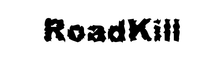
 RoadKill Download RoadKill
 -
Misfit Download Misfit

Commercial Fonts Fonts
-
-
Core Circus Rough Pierrot2 Download Core Circus Rough Pierrot2
Similar free fonts for Core Circus Rough Pierrot2 font


Fonts Commercial Fonts
-
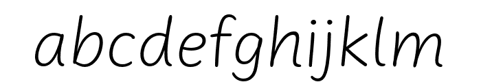
Buy font Uberhand Pro Extlight Commercial Fonts
-
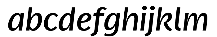
Buy font Real Text Pro Ultralight Italic Commercial Fonts
-
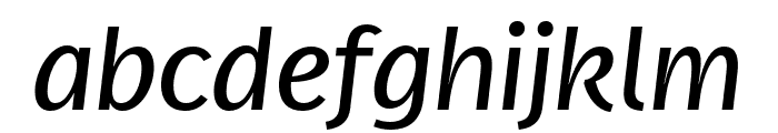
Buy font Real Text Pro Thin Commercial Fonts
-
Buy font Real Text Pro Thin Italic Commercial Fonts
-
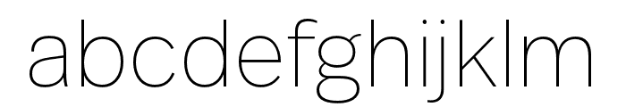
Buy font Real Text Pro Semilight Commercial Fonts
-
Buy font Real Text Pro Semilight Italic Commercial Fonts
-
Buy font Real Text Pro Regular Commercial Fonts
-
Buy font Real Text Pro Regular Italic Commercial Fonts
-
Buy font Real Text Pro Hairline Commercial Fonts
-
Buy font Real Text Pro Hairline Italic Commercial Fonts
-
Buy font Real Text Pro Extralight Commercial Fonts
-
Buy font Real Text Pro Extralight Italic Commercial Fonts
-
Buy font Real Text Pro Extrabold Commercial Fonts
-
Buy font Real Text Pro Demibold Commercial Fonts
-
Buy font Real Text Pro Black Italic Commercial Fonts
-
Buy font Real Head Pro Ultralight Italic Commercial Fonts
-
Buy font Real Head Pro Thin Commercial Fonts
-
Buy font Real Head Pro Thin Italic Commercial Fonts