Komika Display Tight Font

Komika Display Tight Description
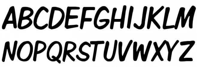
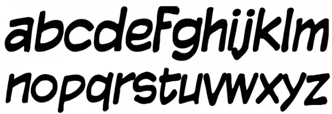
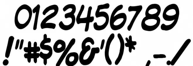
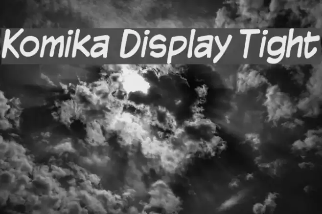
This font features a playful and bold style with a handwritten appearance. The letters are rounded and slightly slanted, giving it a casual and friendly look. The uppercase and lowercase characters maintain a consistent style, with smooth curves and a uniform thickness throughout. The numbers and special characters follow the same design principles, ensuring a cohesive appearance across all glyphs. This font's energetic and informal vibe makes it suitable for creative and fun projects.
A playful, bold, and handwritten-style font with rounded, slanted characters from Uncategorized fonts.
- Downloads: 116
- ( Fonts by Vigilante Typeface Corporation Larry Yerkes. Personal-use only. For commercial use please contact owner. FREE )
- KMKDSPT_.ttf
- Font: Komika Display Tight
- Weight: Regular
- Version: Version 2.0
- No. of Characters:: 227
- Proposed Projects: Ideal for comic books, children's books, playful branding, and casual event invitations.
- Category:
- Bold: Yes
- Italic: No
- Weight: Bold
- Width: Normal
- Character Spacing: Tight
- Contrast: Low
- Overall Style: Playful
- Use Case: Headlines, Logos, Posters
- Encoding Scheme:
- Is Fixed Pitch: No
Glyphs ! # $ % ( ) * + , - . / 0 1 2 3 4 5 6 7 8 9 : ; = ? @ A B C D E F G H I J K L M N O P Q R S T U V W X Y Z [ ] ^ _ ` a b c d e f g h i j k l m n o p q r s t u v w x y z { | } ~
Komika Display Tight UPPERCASE
Komika Display Tight LOWERCASE
Komika Display Tight OTHER CHARS
Gallery Examples

-
 Buy font KG Tightrope Commercial Fonts
 -
 Buy font 2 Quadro Tight Bold Commercial Fonts
 -
 Buy font 2 Quadro Tight Italic Commercial Fonts