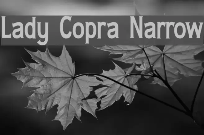
Lady Copra Narrow Font

Lady Copra Narrow Description
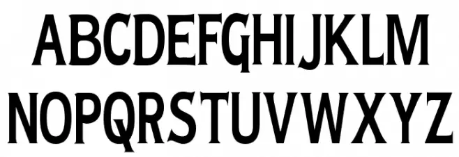
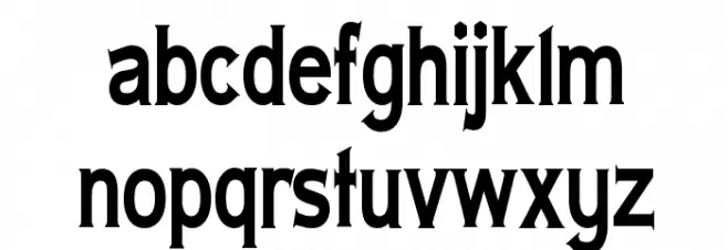
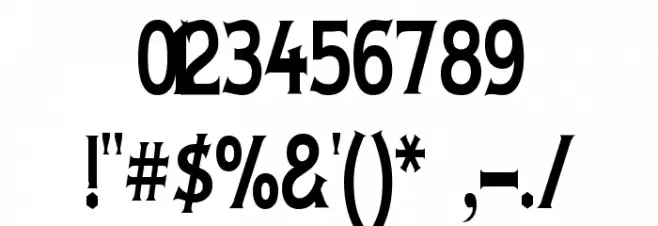
This font features a bold and narrow design, characterized by its strong vertical emphasis and slightly condensed letterforms. The strokes are consistent in width, giving it a uniform appearance. The serifs are prominent yet not overly decorative, adding a touch of elegance to the overall style. The uppercase letters are tall and commanding, while the lowercase letters maintain a balanced proportion. The numerals are clear and easy to read, making them suitable for various applications. Special characters are well-defined, ensuring versatility in usage. This font is ideal for projects that require a strong visual impact without sacrificing readability.
A bold, narrow serif font with strong vertical emphasis and consistent stroke width from Formal fonts.
- Downloads: 509
- ( Fonts by Apostrophic Lab FREE )
- LADYCN__.ttf
- Font: Lady Copra Narrow
- Weight: Regular
- Version: Version 1.0
- No. of Characters:: 227
- Proposed Projects: Ideal for headlines, posters, branding, and editorial design where a strong visual presence is needed.
- Category:
- Bold: Yes
- Italic: No
- Weight: Bold
- Width: Condensed
- Character Spacing: Normal
- Contrast: Low
- Overall Style: Modern
- Use Case: Headlines, Logos, Posters
- Encoding Scheme:
- Is Fixed Pitch: No
Glyphs ! # $ % ( ) * + , - . / 0 1 2 3 4 5 6 7 8 9 : ; = ? @ A B C D E F G H I J K L M N O P Q R S T U V W X Y Z [ ] ^ _ ` a b c d e f g h i j k l m n o p q r s t u v w x y z { | } ~
Lady Copra Narrow UPPERCASE
Lady Copra Narrow LOWERCASE
Lady Copra Narrow OTHER CHARS
Gallery Examples


Download Free Fonts
Commercial Fonts Fonts
-
 Buy font Lady Dodo Commercial Fonts
 -
 Buy font Lady Dodo Patterns Commercial Fonts
 -
 Buy font Lady Fair JF Commercial Fonts