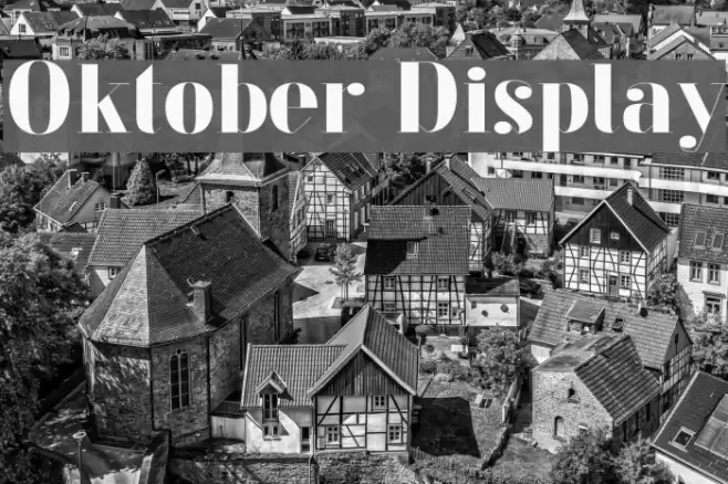
Oktober Display Font

Oktober Display Description
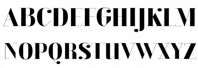
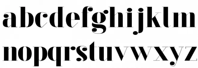
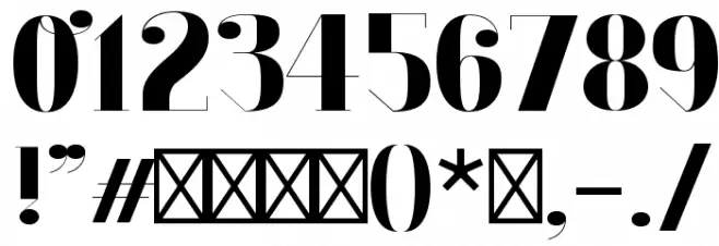
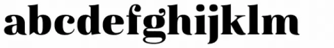
This font features a bold and striking design with high contrast between thick and thin strokes, giving it a dramatic and eye-catching appearance. The uppercase letters are tall and elegant, with sharp serifs that add a touch of sophistication. The lowercase letters maintain a consistent style, with rounded forms and a playful yet refined look. The numerals are equally bold, ensuring they stand out in any context. Special characters are designed with the same attention to detail, making them perfect for creative and impactful designs. Overall, this font combines modern aesthetics with a classic touch, making it versatile for various design needs.
A bold, high-contrast font with elegant serifs and a modern yet classic style from Uncategorized fonts.
- Downloads: 406
- ( Fonts by Johannes Hirsekorn - Personal-use only. For commercial use please contact owner. FREE )
- oktober-display.otf
- Font: Oktober Display
- Weight: Regular
- Version: Version 1.001;PS 001.001;hotconv 1.0.70;makeotf.lib2.5.58329
- No. of Characters:: 108
- Proposed Projects: Ideal for branding, headlines, posters, and any project requiring a strong visual impact.
- Category:
- Bold: Yes
- Italic: No
- Weight: Bold
- Width: Normal
- Character Spacing: Normal
- Contrast: High
- Overall Style: Modern
- Use Case: Headlines, Logos
- Encoding Scheme:
- Is Fixed Pitch: No
Glyphs ! # ( ) * , - . / 0 1 2 3 4 5 6 7 8 9 : ; ? A B C D E F G H I J K L M N O P Q R S T U V W X Y Z [ ] ^ _ a b c d e f g h i j k l m n o p q r s t u v w x y z { } ff fi fl ffi
Oktober Display UPPERCASE
Oktober Display LOWERCASE
Oktober Display OTHER CHARS
Gallery Examples


Download Free Fonts
-
 Buy font Magnel Display Black Commercial Fonts
 -
 Buy font Magnel Display Black Italic Commercial Fonts
 -
 Buy font Magnel Display Bold Italic Commercial Fonts