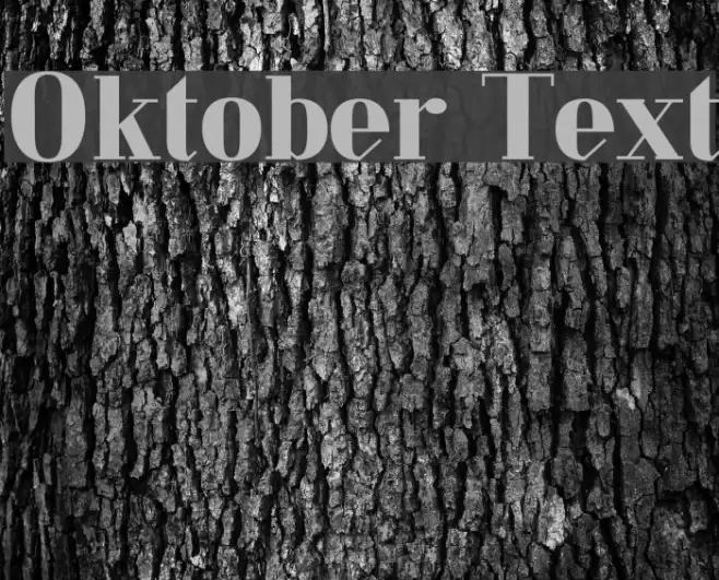
Oktober Text Font

Oktober Text Description
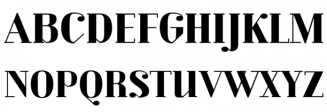
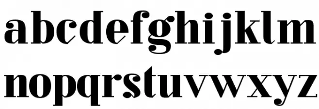
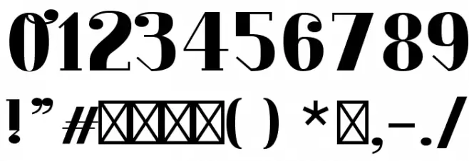
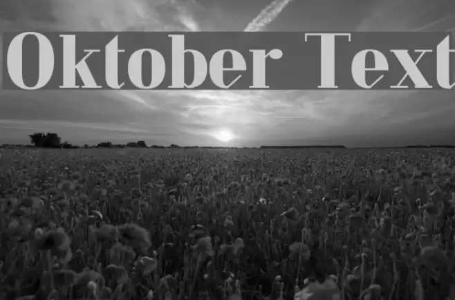
This font features a bold and striking design with high contrast between thick and thin strokes, giving it a dramatic and elegant appearance. The serifs are pronounced and add a touch of sophistication, while the overall structure maintains a sense of modernity. The uppercase letters are tall and commanding, while the lowercase letters offer a balanced and harmonious look. The numerals are consistent with the font's bold style, ensuring readability and impact. Special characters are designed with the same attention to detail, making this font versatile for various applications.
A bold, high-contrast serif font with elegant and modern characteristics from Uncategorized fonts.
- Downloads: 207
- ( Fonts by Johannes Hirsekorn - Personal-use only. For commercial use please contact owner. FREE )
- oktober-text.otf
- Font: Oktober Text
- Weight: Regular
- Version: Version 1.001;PS 001.001;hotconv 1.0.70;makeotf.lib2.5.58329
- No. of Characters:: 108
- Proposed Projects: Ideal for headlines, branding, editorial design, and luxury product packaging.
- Category:
- Bold: Yes
- Italic: No
- Weight: Bold
- Width: Normal
- Character Spacing: Normal
- Contrast: High
- Overall Style: Modern
- Use Case: Headlines, Logos
- Encoding Scheme:
- Is Fixed Pitch: No
Glyphs ! # ( ) * , - . / 0 1 2 3 4 5 6 7 8 9 : ; ? A B C D E F G H I J K L M N O P Q R S T U V W X Y Z [ ] ^ _ a b c d e f g h i j k l m n o p q r s t u v w x y z { } ff fi fl ffi
Oktober Text UPPERCASE
Oktober Text LOWERCASE
Oktober Text OTHER CHARS
Gallery Examples

Download Free Fonts
-
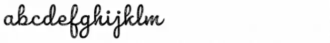 Buy font Combine Script Texture Commercial Fonts
 -
 Buy font Inkston Text Commercial Fonts
 -
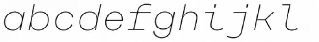 Buy font Rational TW Text Thin Italic Commercial Fonts