Fonts
Starstruck Font
Description
- Starstruck.ttf
- Font: Starstruck
- Weight: Regular
- Version: Version Macromedia Fontographer 4.1 3/19/02
- No. of Characters:: 90
- Encoding Scheme:
- Is Fixed Pitch: 0
Welcome to the Font Trends page — your destination for discovering which fonts are shaping today’s design landscape. Whether you’re working on a brand refresh, social media visuals, or website UI, following current font trends helps your work feel fresh and relevant.
This collection features the most trending fonts of the season, chosen by designers and creators across the world. Expect to see elegant serifs, minimalist sans serifs, expressive display fonts, and handcrafted scripts that define modern aesthetics in 2025.
Combine your favorite trending typefaces with timeless categories like Modern, Serif, or Handwritten for a balanced and eye-catching design.
-
( Fonts by Apostrophic Lab )
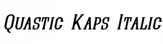
A bold, italic serif font with a modern, dynamic style.
 Download 143 Downloads@WebFont
 -
( Fonts by Apostrophic Lab )
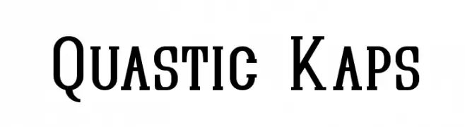
A bold, structured serif font with a modern twist, ideal for impactful designs.
![Quastic Kaps Free Fonts Download]() Download 222 Downloads@WebFont
Download 222 Downloads@WebFont -
( Fonts by Apostrophic Lab )
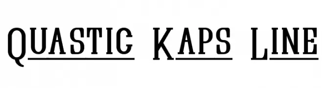
A bold, serif font with strong strokes and sharp serifs, ideal for impactful designs.
![Quastic Kaps Line Free Fonts Download]() Download 192 Downloads@WebFont
Download 192 Downloads@WebFont -
( Fonts by Apostrophic Lab )
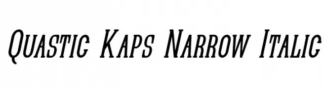
A narrow, italicized font with medium contrast and a modern style.
![Quastic Kaps Narrow Italic Free Fonts Download]() Download 169 Downloads@WebFont
Download 169 Downloads@WebFont -
( Fonts by Apostrophic Lab )
Elegant italic font with moderate contrast and strong presence.
![Quastic Kaps Line Italic Free Fonts Download]() Download 135 Downloads@WebFont
Download 135 Downloads@WebFont -
![Speedster Free Fonts Download]() Download 455 Downloads@WebFont
Download 455 Downloads@WebFont -
![Arwing Free Fonts Download]() Download 778 Downloads@WebFont
Download 778 Downloads@WebFont -
![Belfast Free Fonts Download]() Download 1800 Downloads@WebFont
Download 1800 Downloads@WebFont


FAQ — Font Trends
What are the current font trends?
Simplicity, legibility, and warmth dominate: rounded sans serifs, high-contrast serifs, and tasteful retro revivals are everywhere — clean but human.
Which fonts are trending in design right now?
Popular choices include Quastic Kaps Italic, Quastic Kaps, Quastic Kaps Line, Quastic Kaps Narrow Italic and Quastic Kaps Line Italic — fonts known for their balance between modern and timeless. They look great on web pages, social content, and packaging, bringing a clean yet expressive feel.
How do I use trending fonts in my projects?
Use one standout display font for titles and pair it with a simple sans serif for body text. This creates contrast without losing readability. Always test how your chosen font trend performs across screen sizes and branding materials before finalizing.
💡 Tip: Refresh key assets every few months with a new trending font to keep visuals sharp and discoverable.